


Client
Ocean Sustainability Foundation
location
France
Year
2026
Services
awards

client
Ocean Sustainability Foundation
location
France
year
2026
ServiceS
Ocean Sustainability Foundation (OSF)
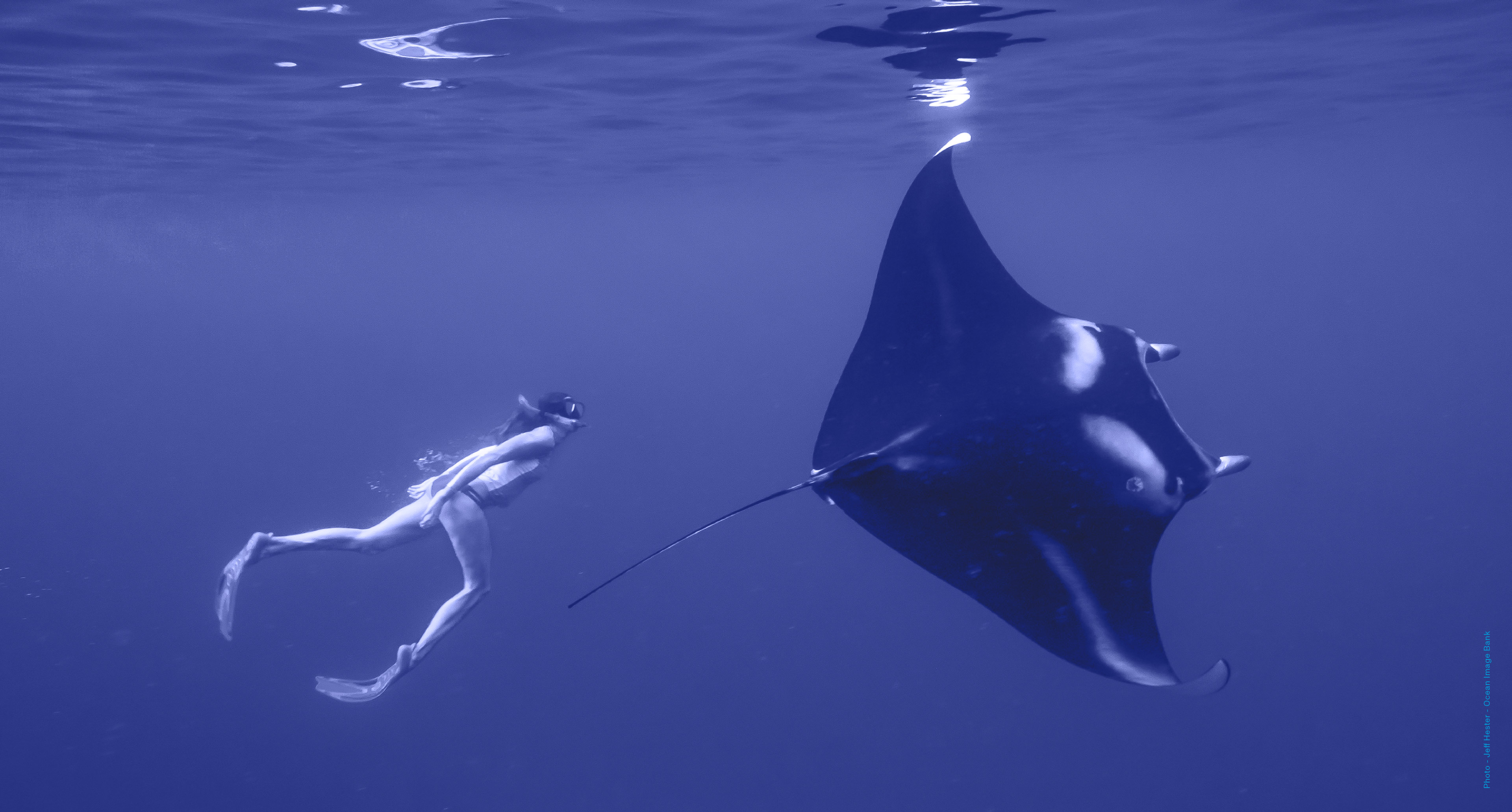
Hosted by the CNRS Foundation, the Ocean Sustainability Foundation connects global ocean science, knowledge, and experience to accelerate transformative policy decisions and concrete actions.
The organisation’s work can be explored here
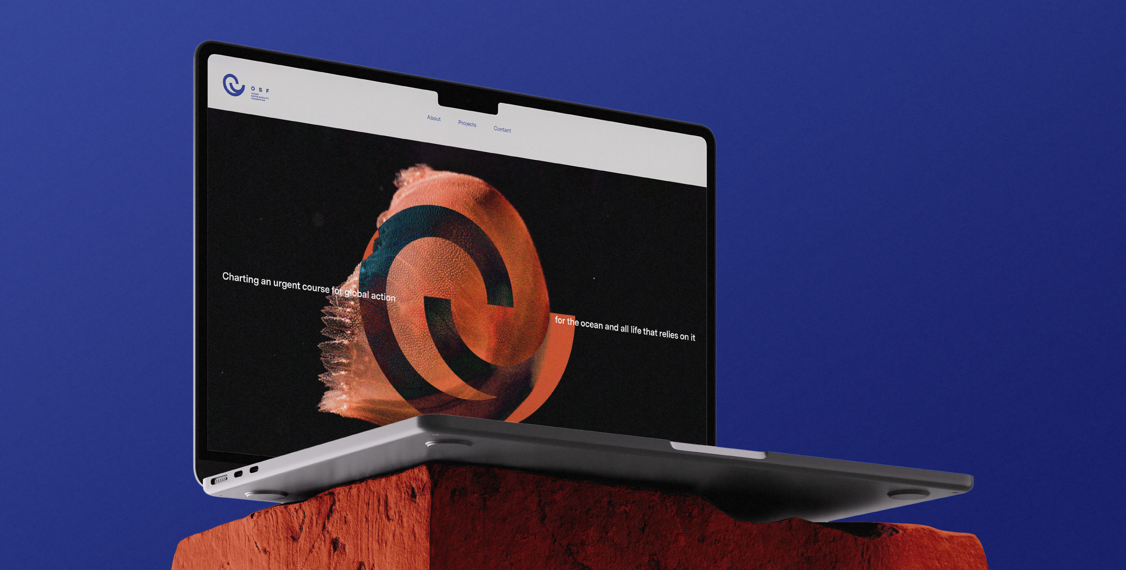
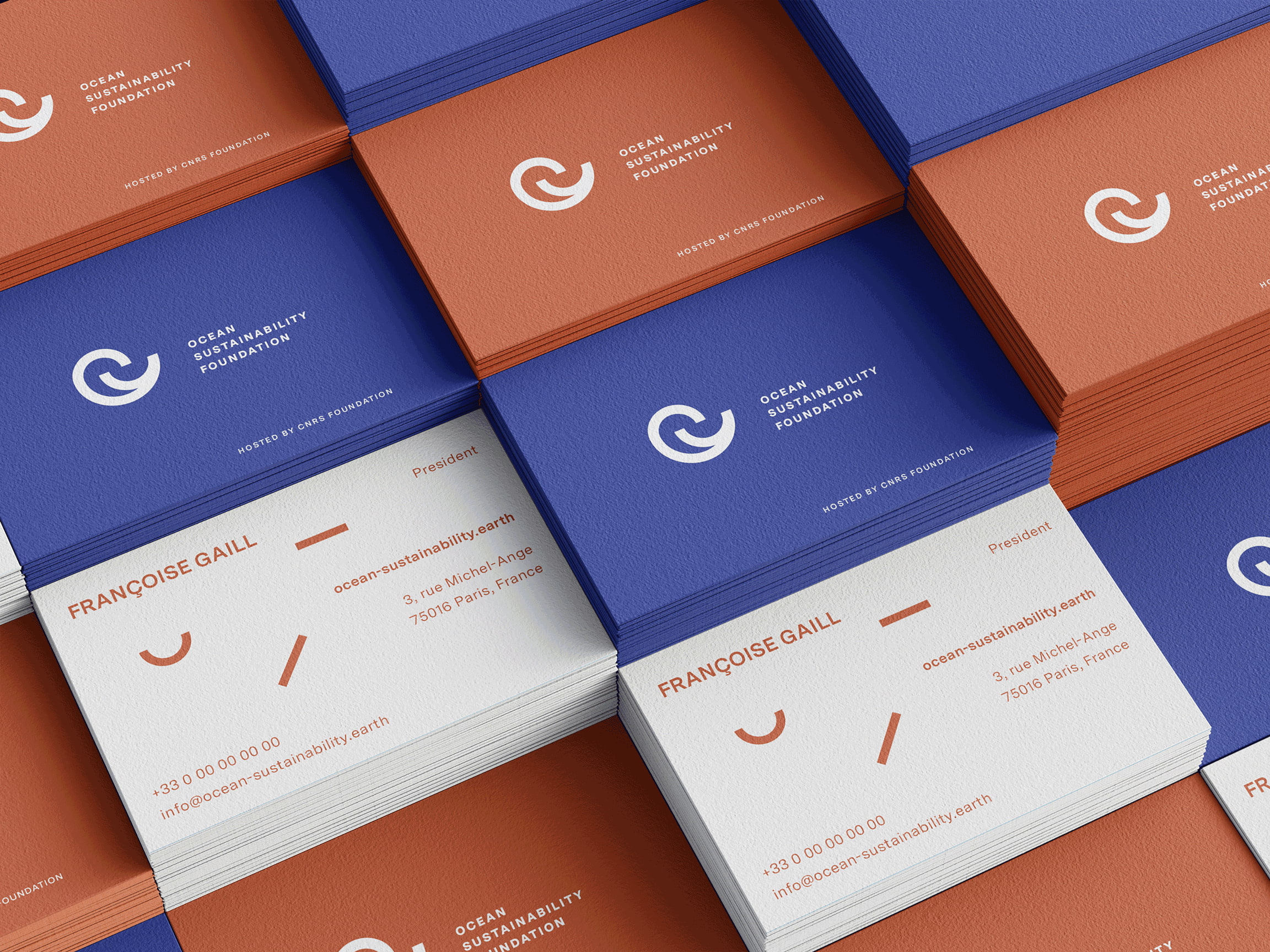
As the Foundation entered a new phase of visibility initiating and establishing international synergies, a brand-new identity was designed to convey clarity, credibility, and care. A visual identity was developed including a new logotype, report design, website, and core brand applications able to support scientific content, presentations, digital platforms, and future-facing initiatives.
Our collaboration began with a workshop in Paris, to define how the OSF should be presented to the world: trusted, active, and globally relevant.

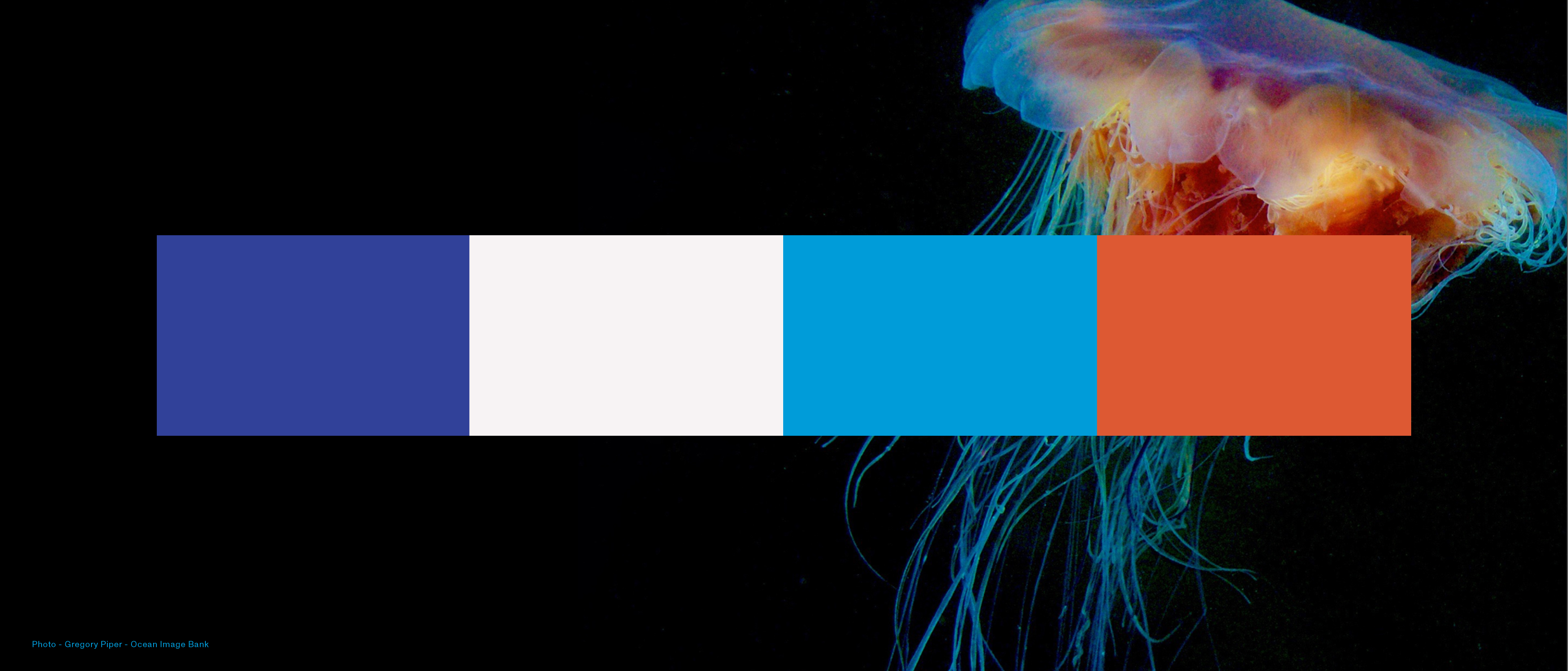
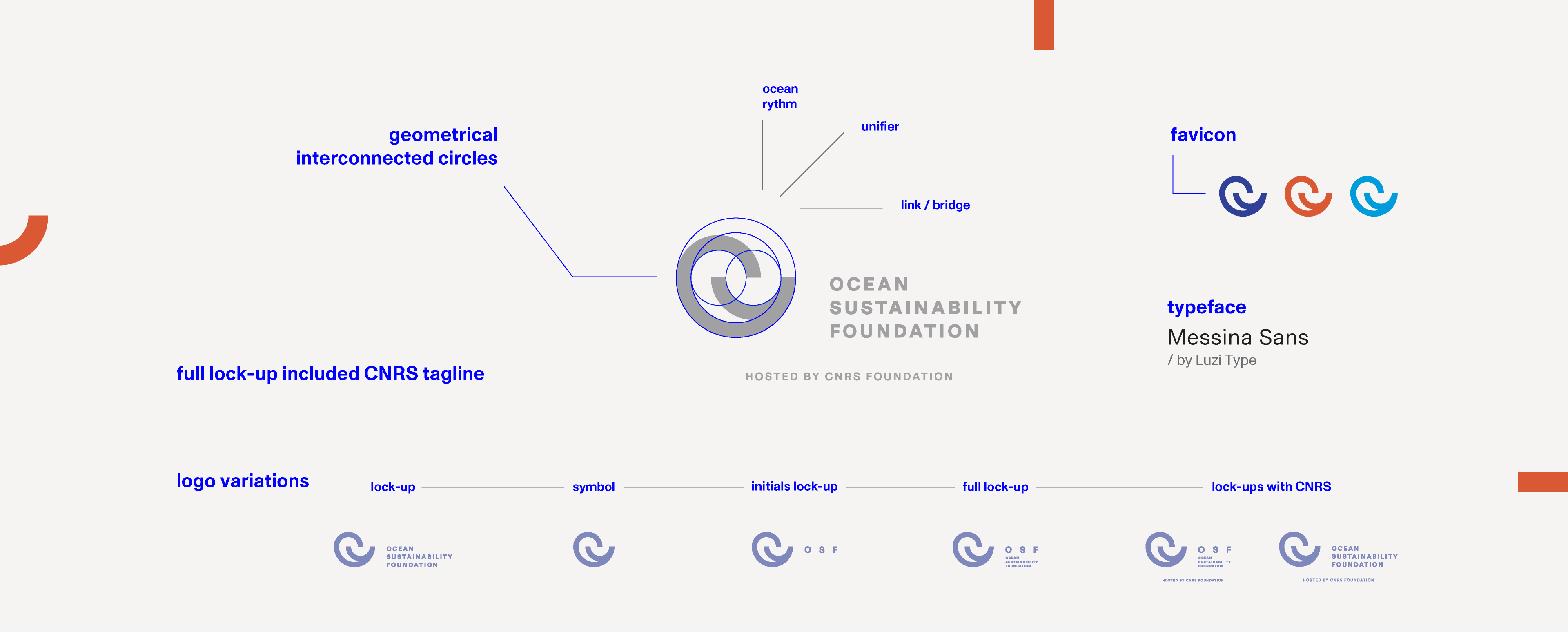
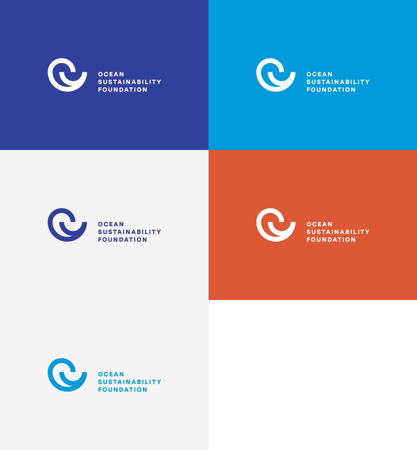
At the centre of its renewed identity, the new logotype is built around an open, interconnected circular form, reflecting the Foundation’s role as a unifying presence.
Inspired by the natural rhythms of the ocean, it conveys continuity, openness, and trust, linking insight and action with restraint. The result feels balanced, shaped by expertise, understanding, and respect, guided by the human effort behind it.

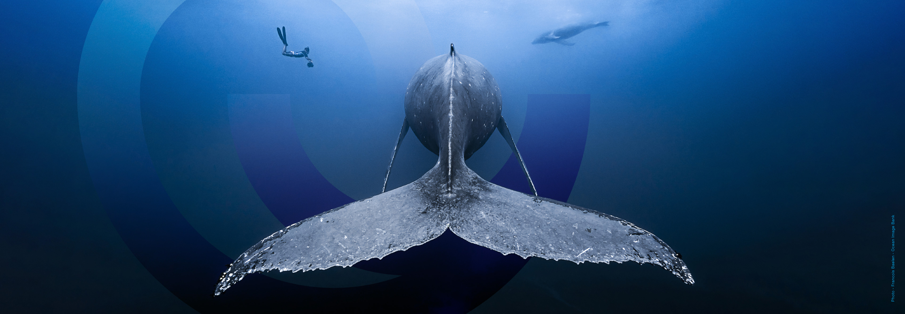

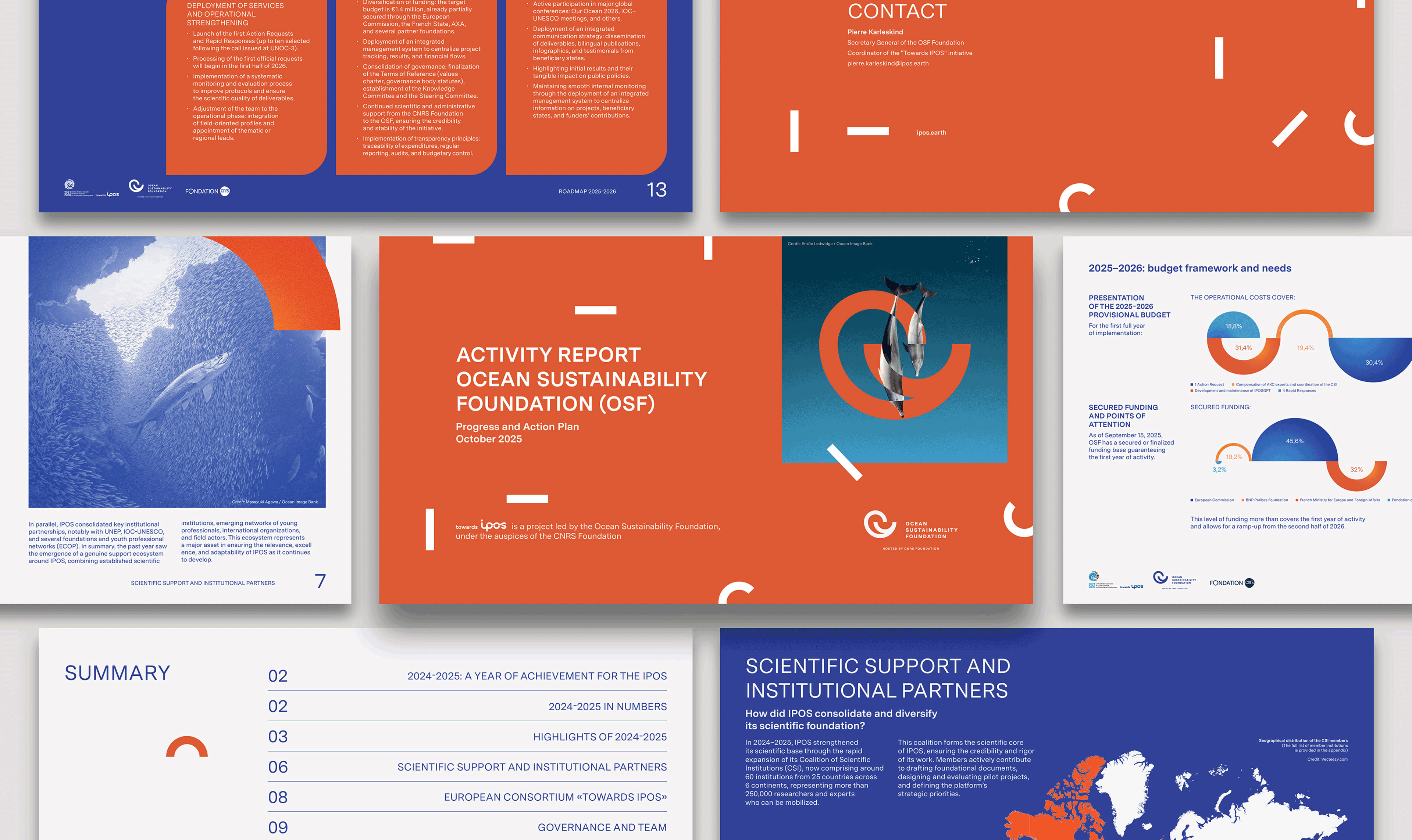
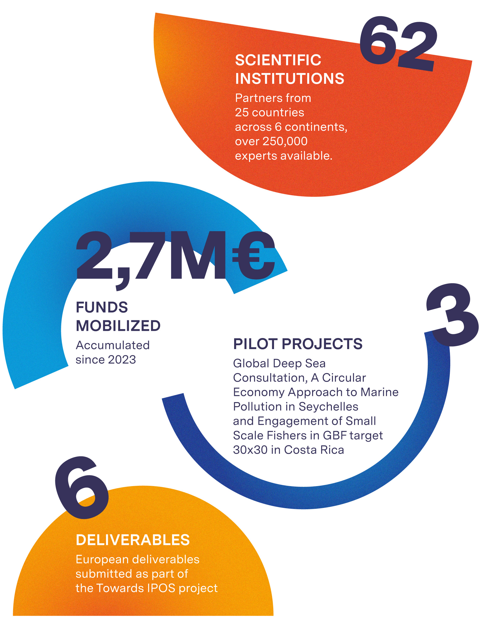
For the report design, we extended the visual system into a format able to hold milestones, data, and institutional communication with consistency.
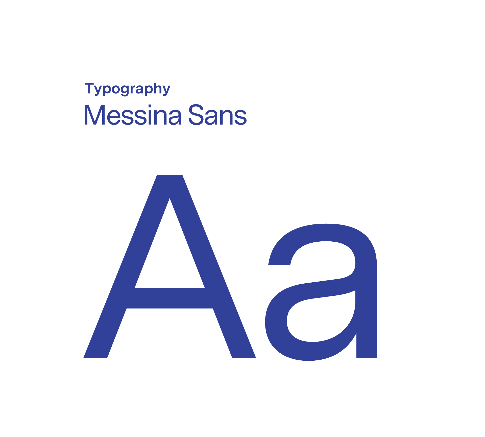
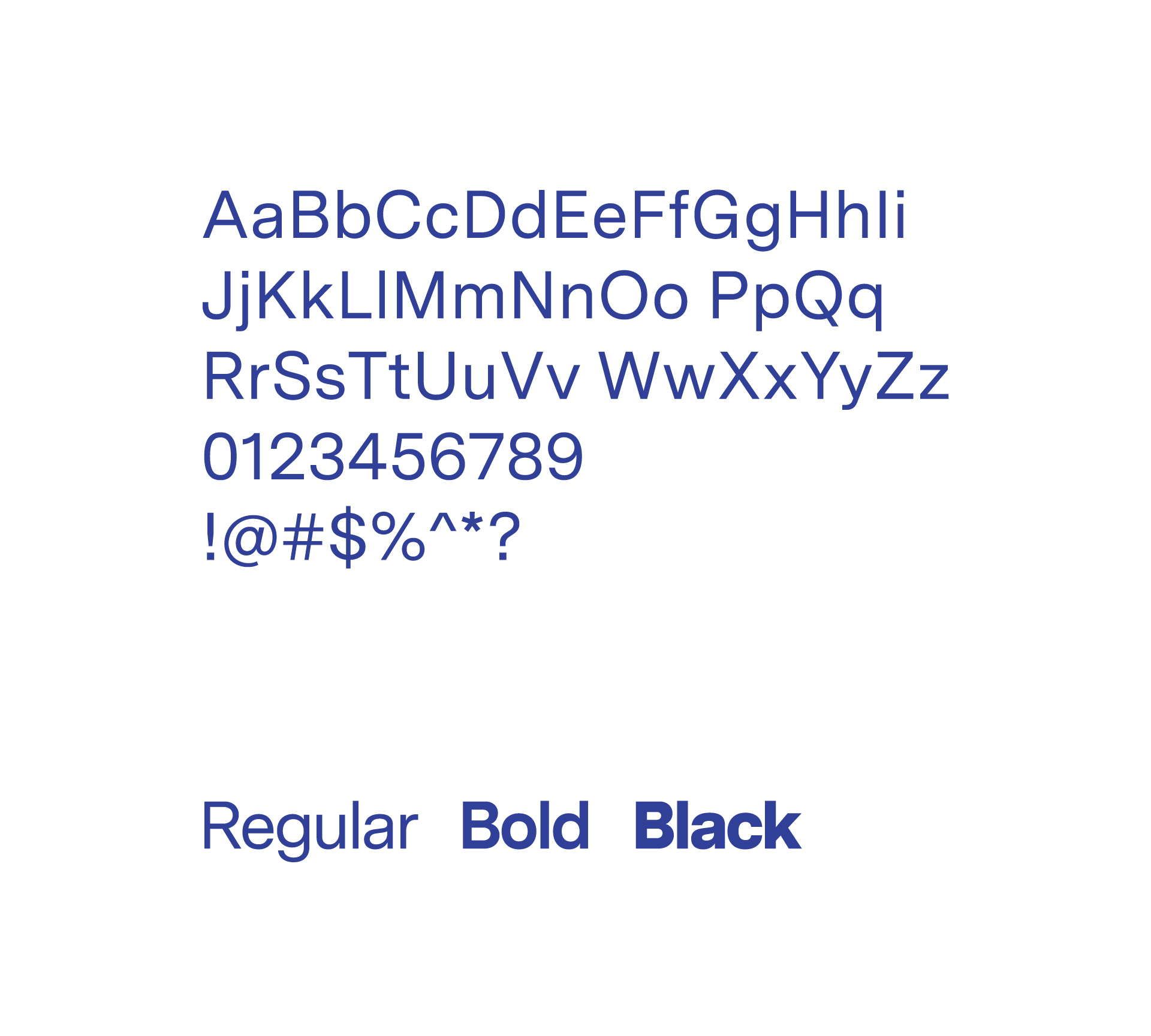
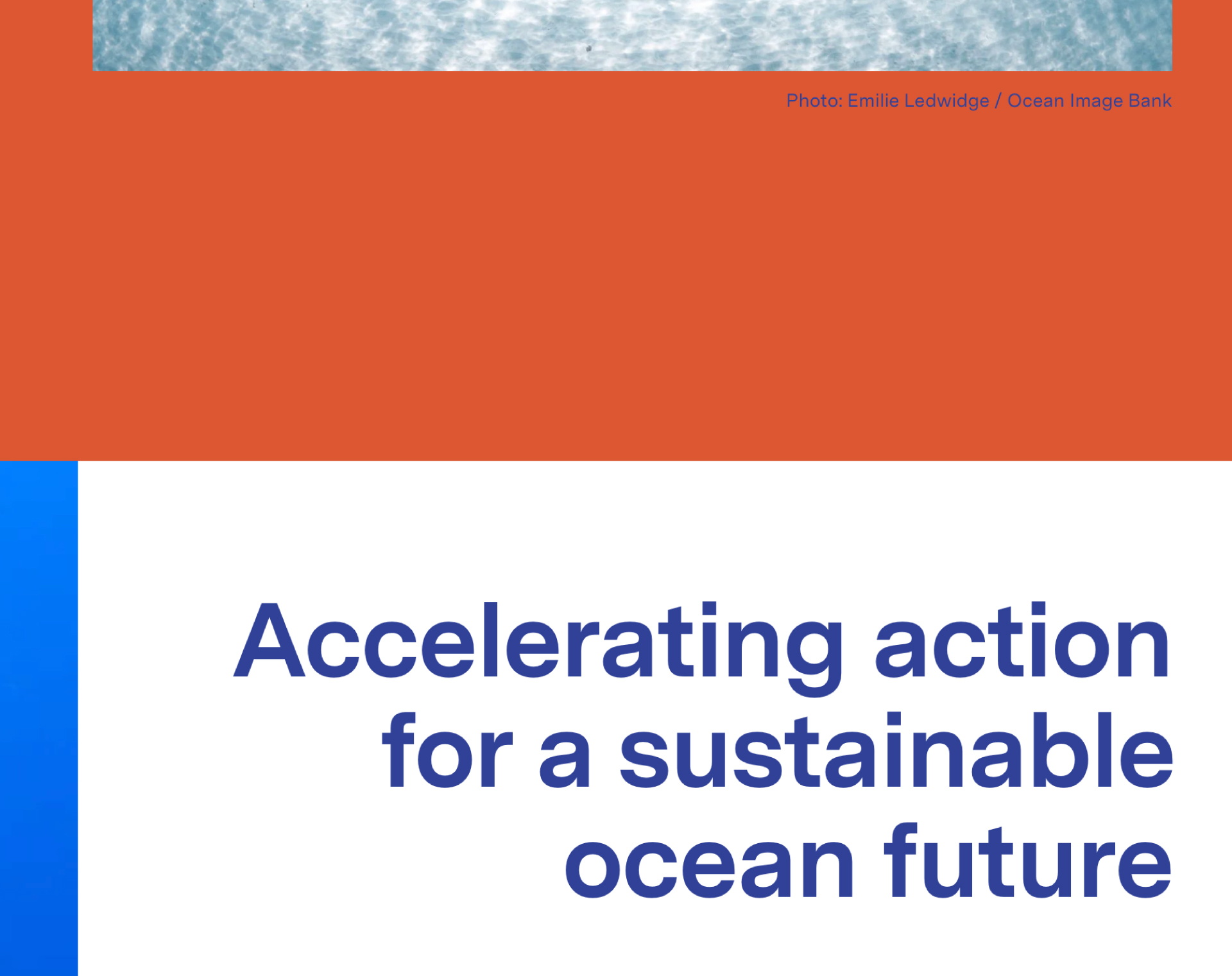
Through typography, hierarchy, layout, imagery, iconography, and graphic elements, it became a clear expression of the OSF fresh image.
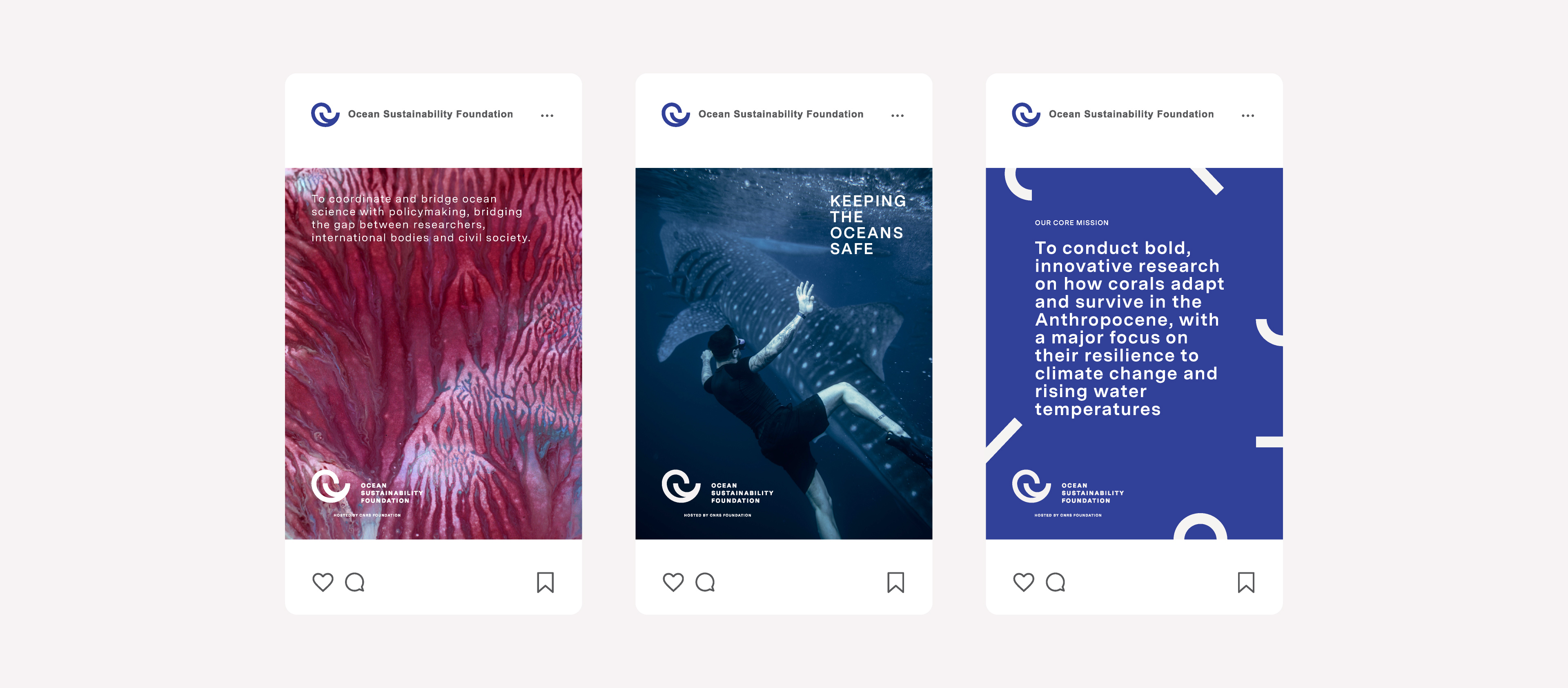
Embracing the new rebranding values, the design is sophisticated yet structured to guide different audiences through elaborate material in a direct and intuitive way.
The design approach was data-driven, with carefully placed content breakers, visuals, and editorial flow to make the experience engaging without becoming tiring to the eye. A deep color palette supports focused reading, while the overall text volume was reduced to make the content more approachable.
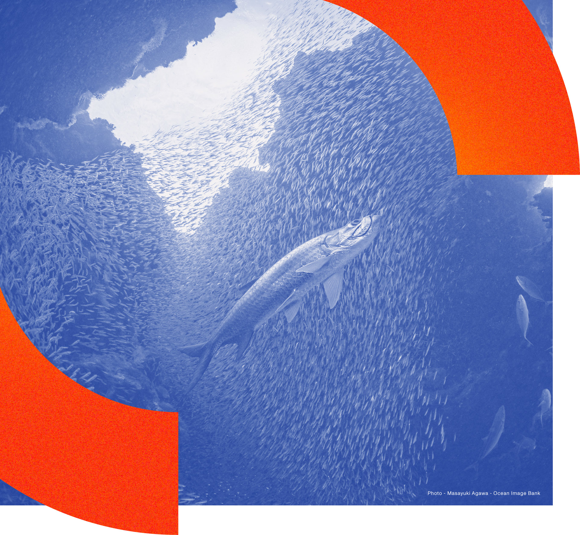
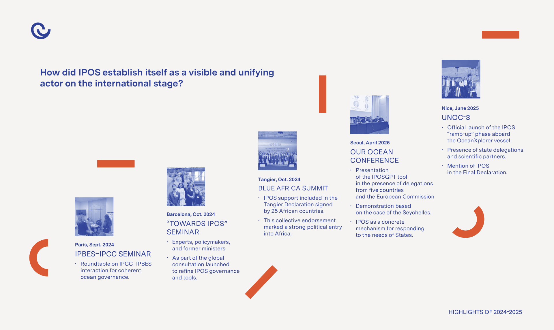
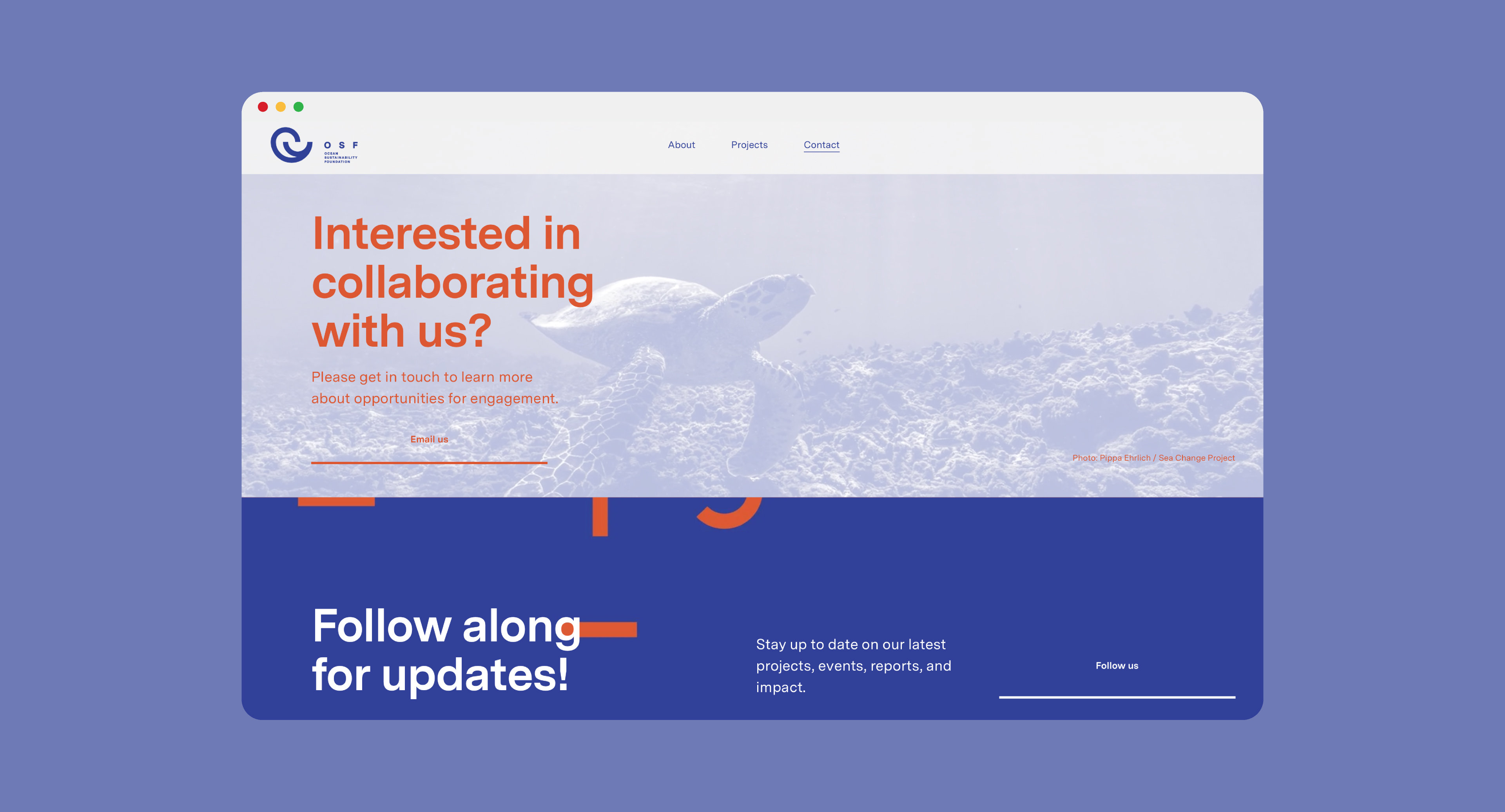
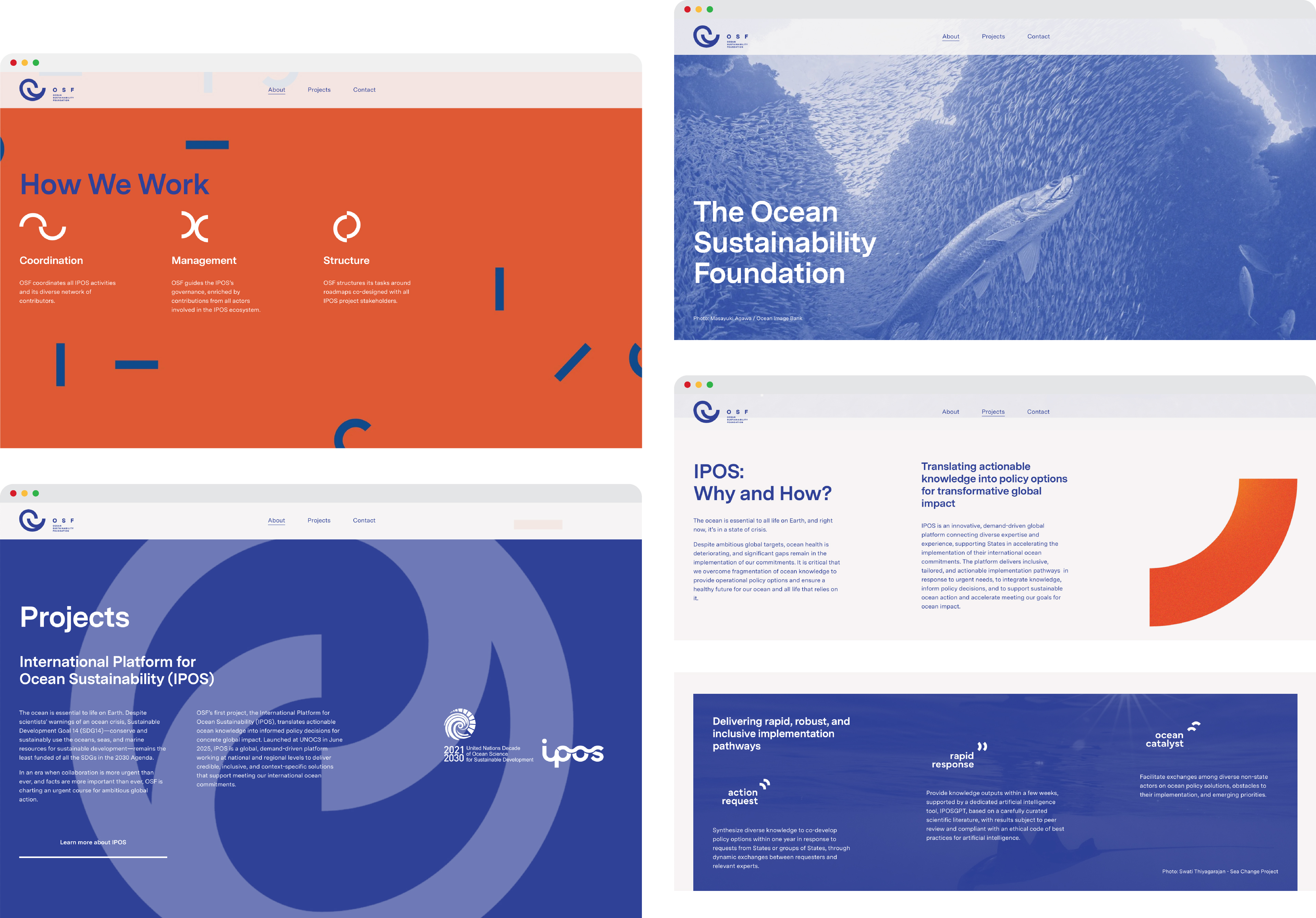
The result is a website rich in content still attractive, institutional, and easy to navigate. Also, dedicated subpages for annual reports and other key publications were created, allowing for each one to function autonomously.
As IPOS, the International Platform for Ocean Sustainability, is the Foundation’s first project and an integral part of how OSF works, we refined and strengthened its existing visual language. We aimed at bringing more consistency and confidence to creating a closer relationship between OSF and IPOS while allowing the platform to retain its own distinct role and presence. The IPOS project will be presented as a separate case.






see relevant work



see relevant work

MEET
let's

Jannik Weylandt
Managing Director - Partner
Rådhusstræde 5, 1.
DK-1466 Copenhagen K
Denmark
T +45 53852840
Managing Director - Partner
Rådhusstræde 5, 1.
DK-1466 Copenhagen K
Denmark
T +45 53852840
jannik@lazysnail.design

COLLABS:
Copywriting support: Mallory Staub


Let’s get together!
Please send us an email and we will reach out to you. We can either arrange an online meeting or, even better, a face-to-face meetup.
Don't forget to include the most significant information about you & your project, such as: Full Name / Company Name & domain / email / Country & your message about your request.
Don't forget to include the most significant information about you & your project, such as: Full Name / Company Name & domain / email / Country & your message about your request.


