Stonetech is a natural stone company with a 50-year heritage in marble production, direct quarry access and international supply. Its expertise spans the entire process, from sourcing and material selection to technical guidance and architectural execution. As the business prepared for its next chapter, it needed a refreshed positioning that could communicate this broader expertise and establish Stonetech not simply as a supplier, but as a trusted material expert and project partner.
Lazy snail was asked to reimagine the Stonetech brand, evolving its logo and visual identity to feel instantly recognizable, premium, functional and enduring.
The challenge was to create a more contemporary presence without losing the trust the company had built over decades.
No items found.
Precision Built in Stone
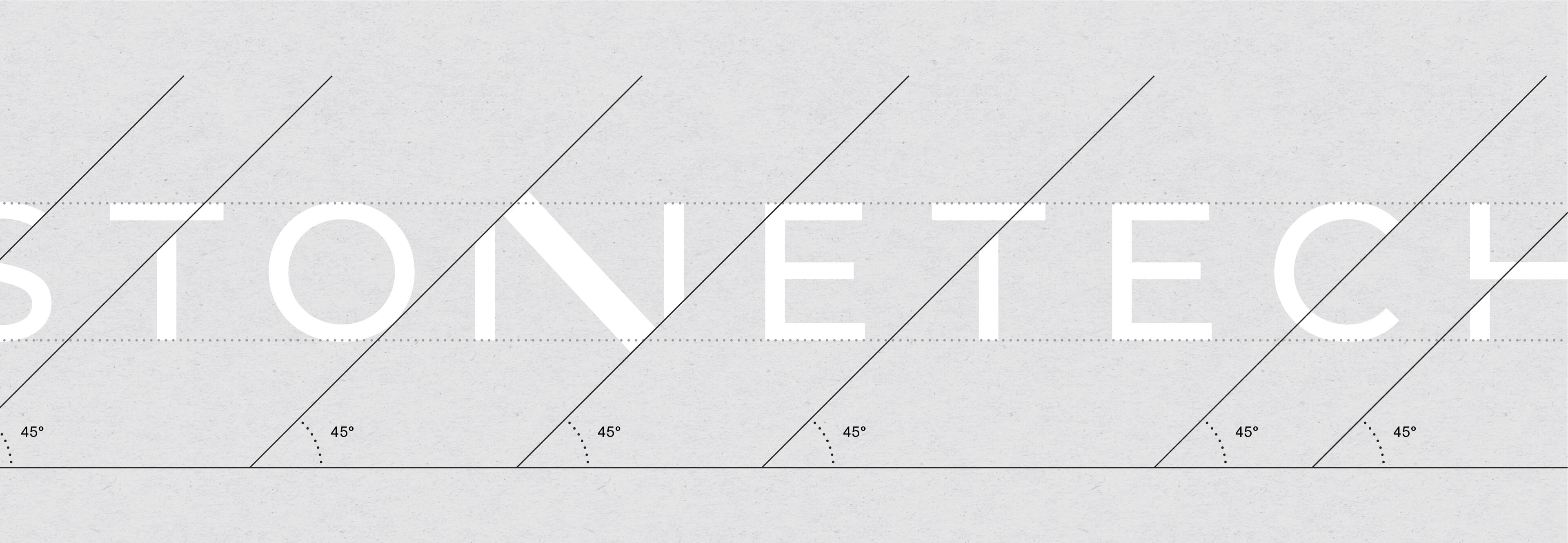
Following an extensive study of the market and its direct and indirect competitors, the identity was shaped around Stonetech’s defining qualities: precision, control and technical expertise. The visual language draws from the process of cutting and refining stone, using sharp angles, balanced proportions and a considered composition to express confidence, craftsmanship and permanence.
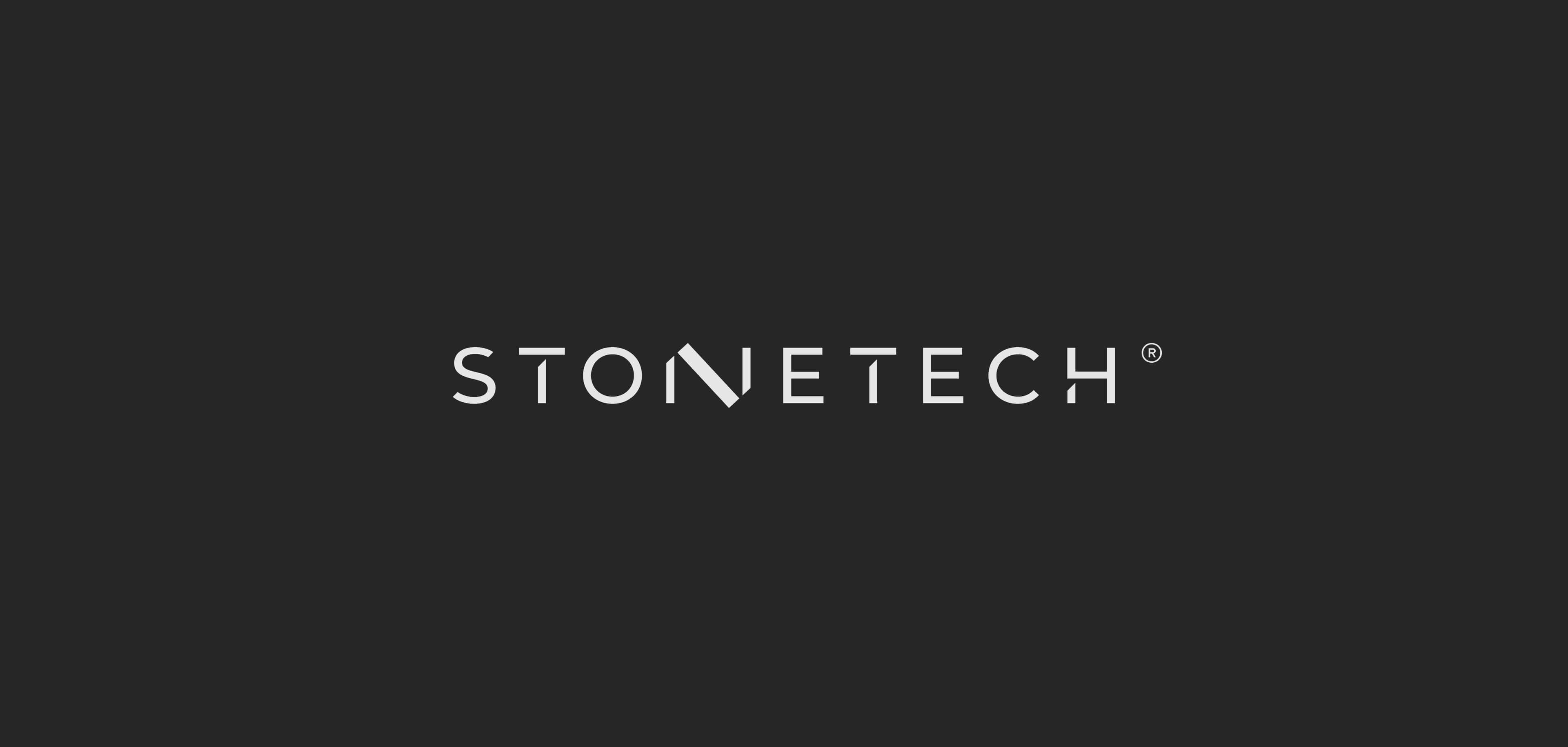
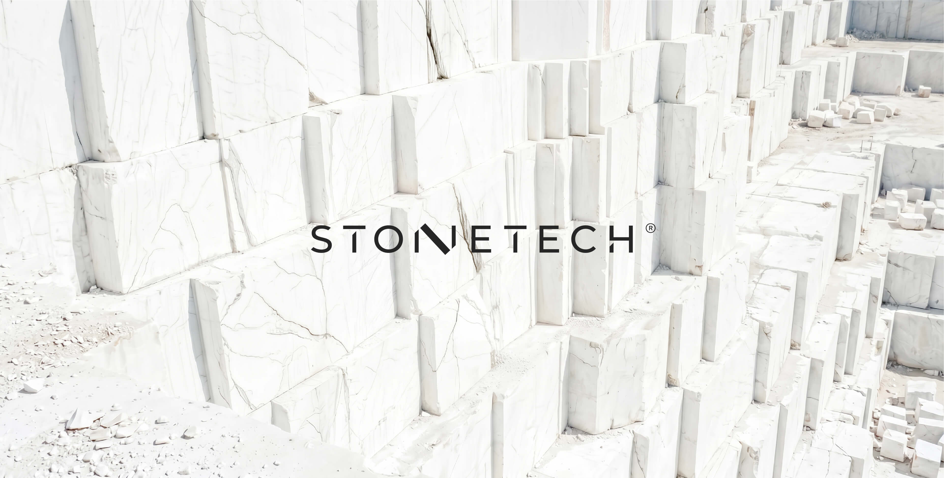
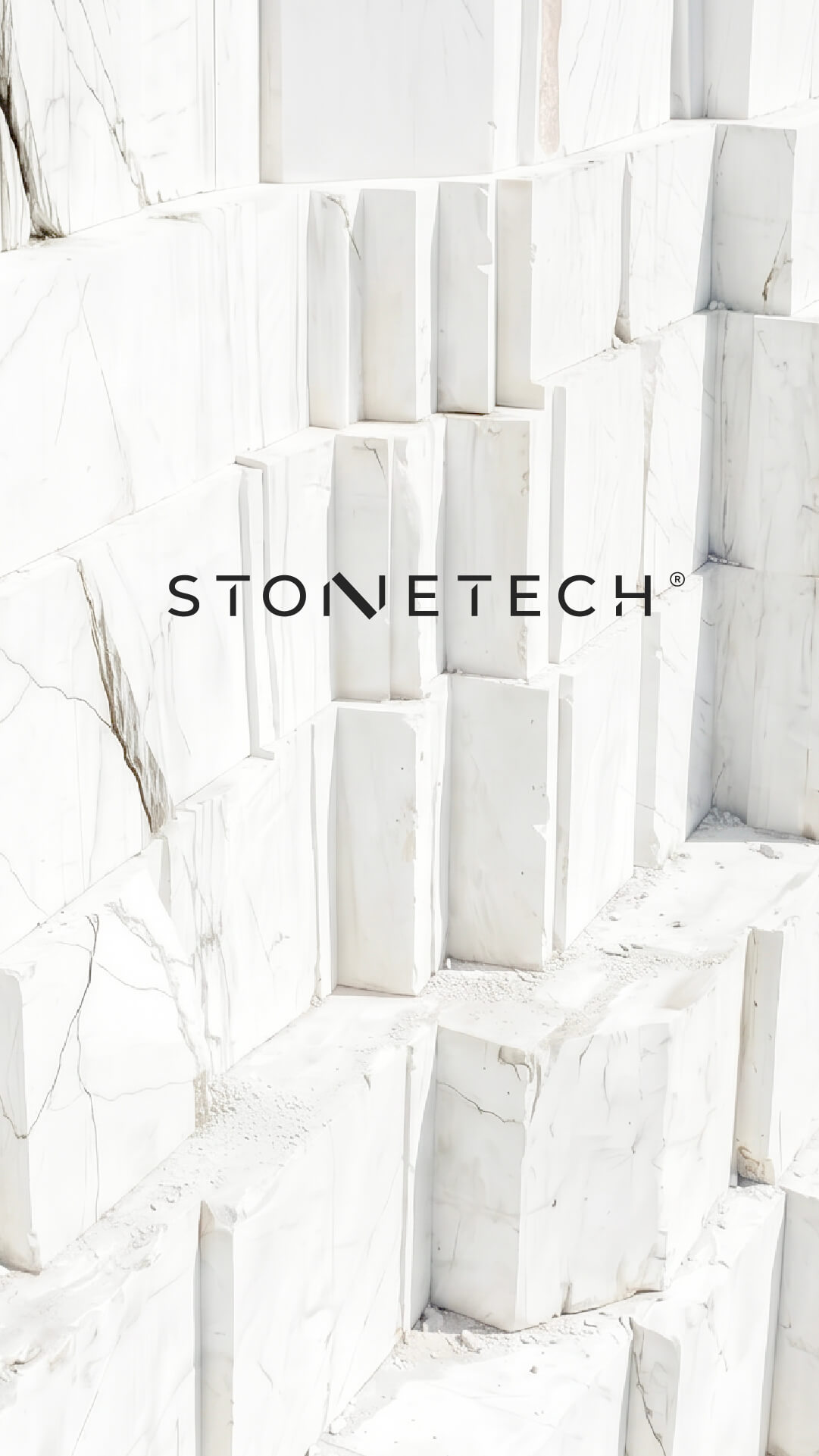
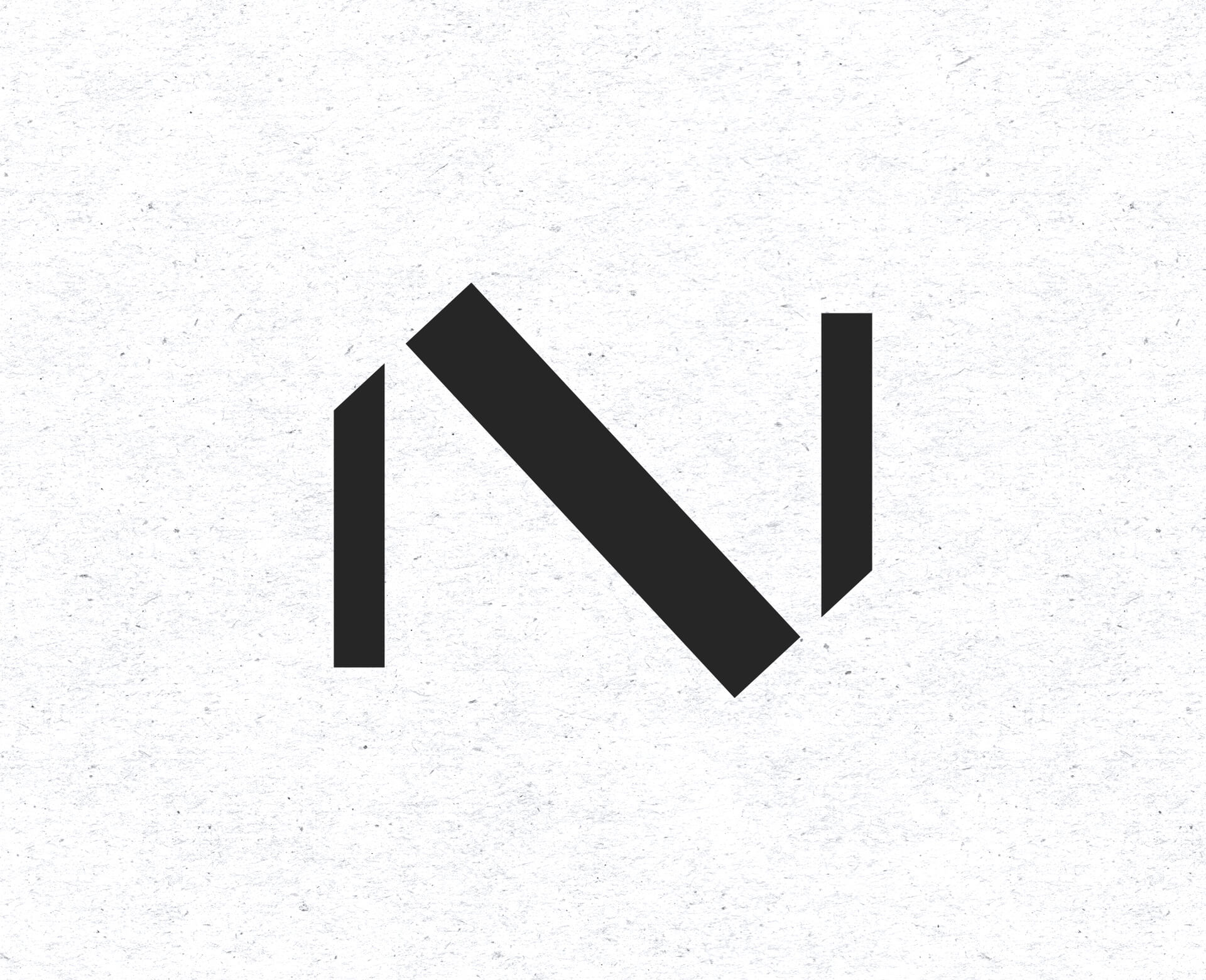
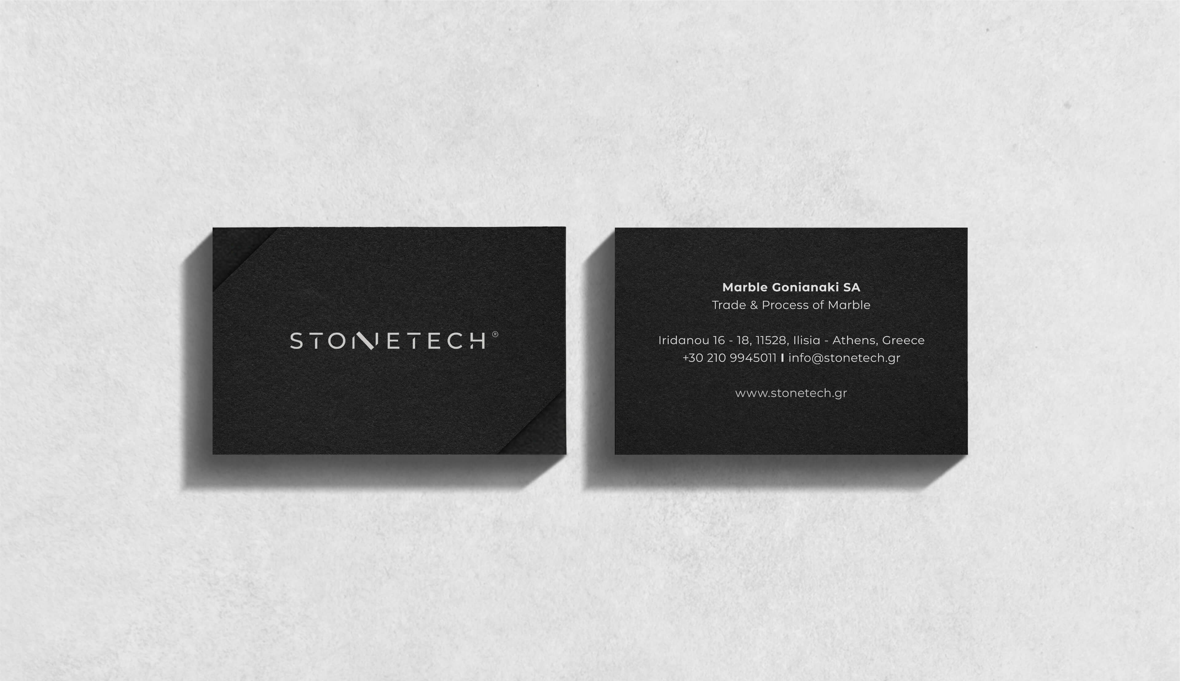
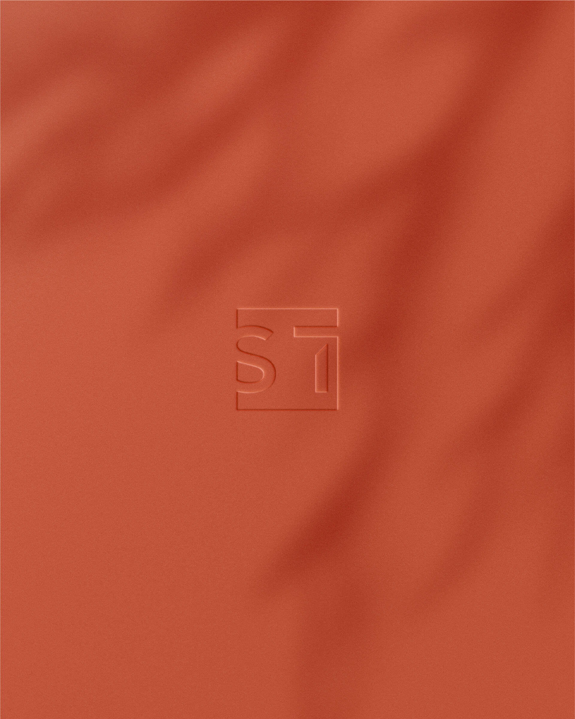
At the centre of the logotype, the letter N is shaped as a geometric marble block held between two supporting forms. Despite its solid construction, the design remains elegant, avoiding the visual weight often associated with stone. Minimal yet distinctive, the identity balances mass with fine detailing, giving Stonetech a contemporary expression of quiet luxury.
A Material-Led Visual System
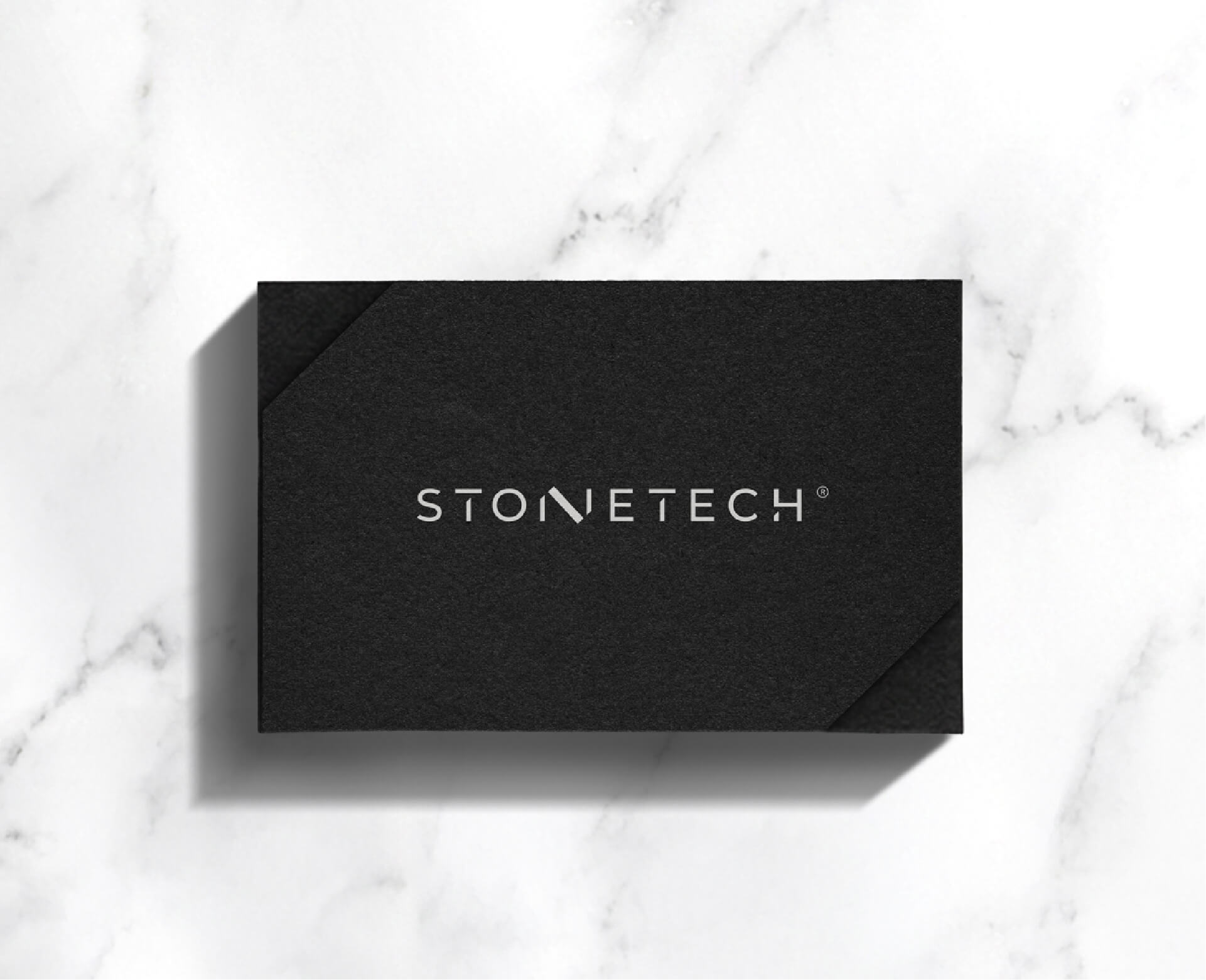
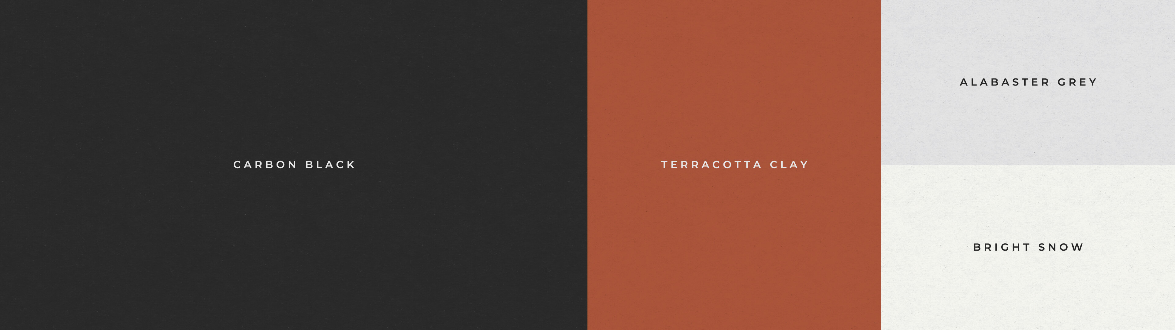
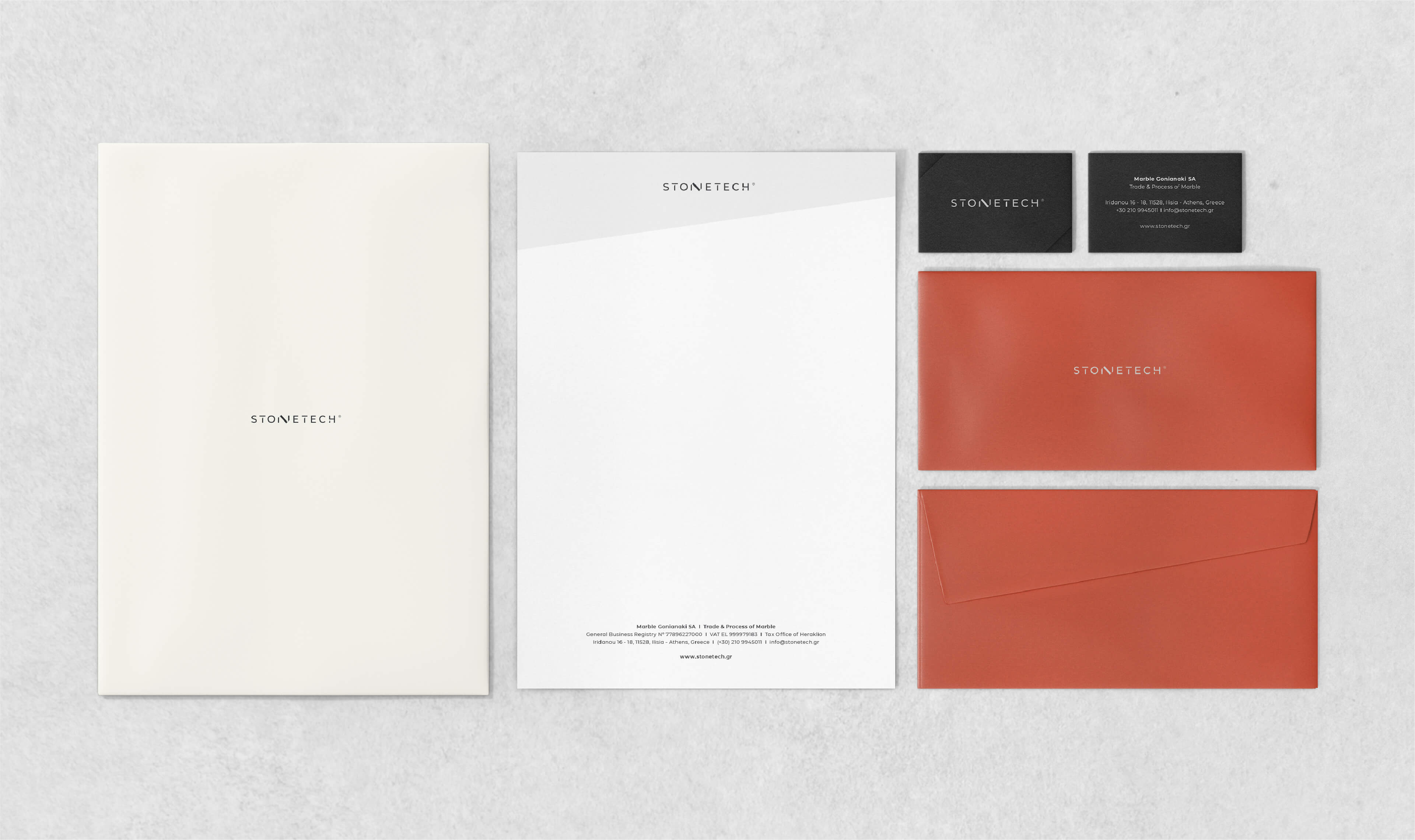
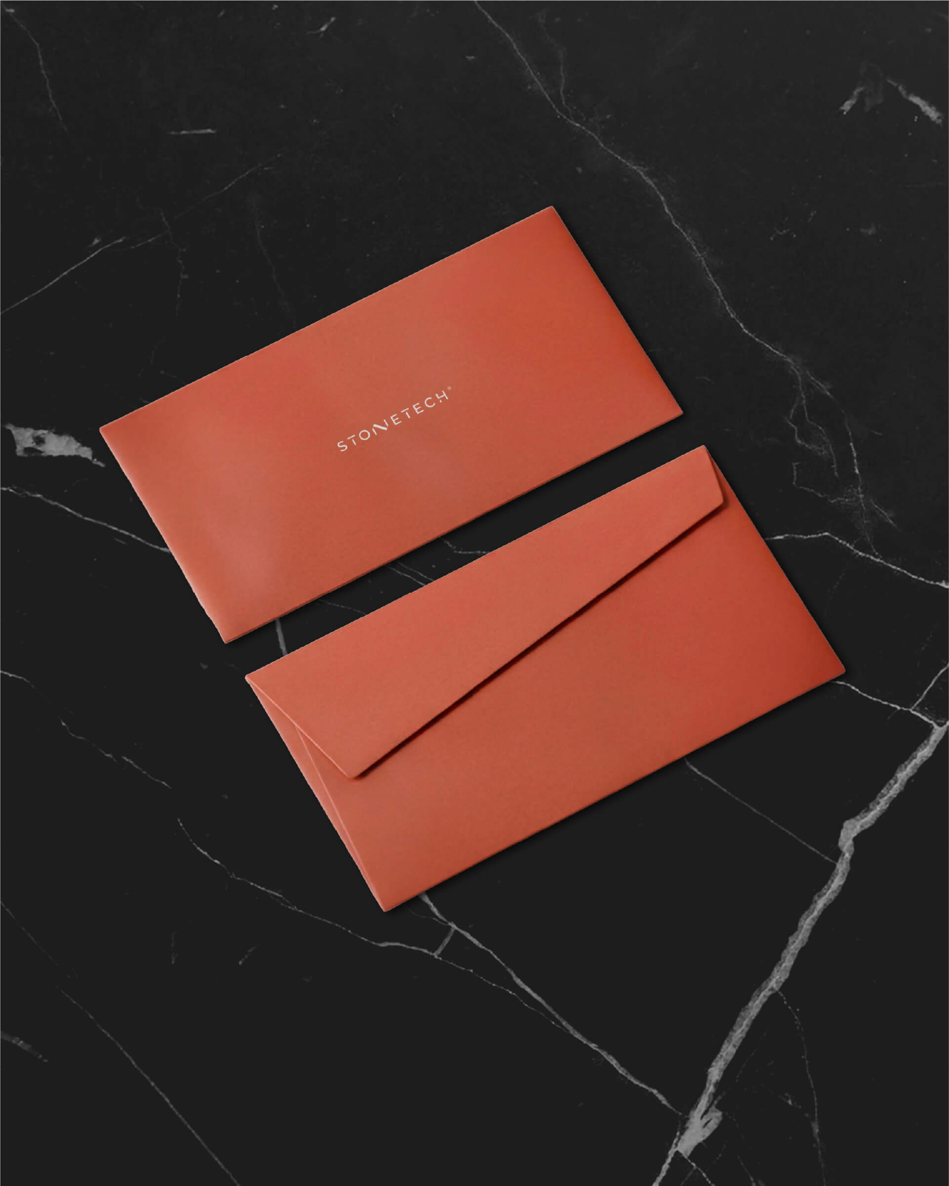
The visual identity was conceived as a complete system, extending the core concept across colour, typography, pattern, imagery and applications. A palette of black, terracotta and grey was matched with a selection of coloured technical papers, giving the printed applications a more tactile and organic feel.
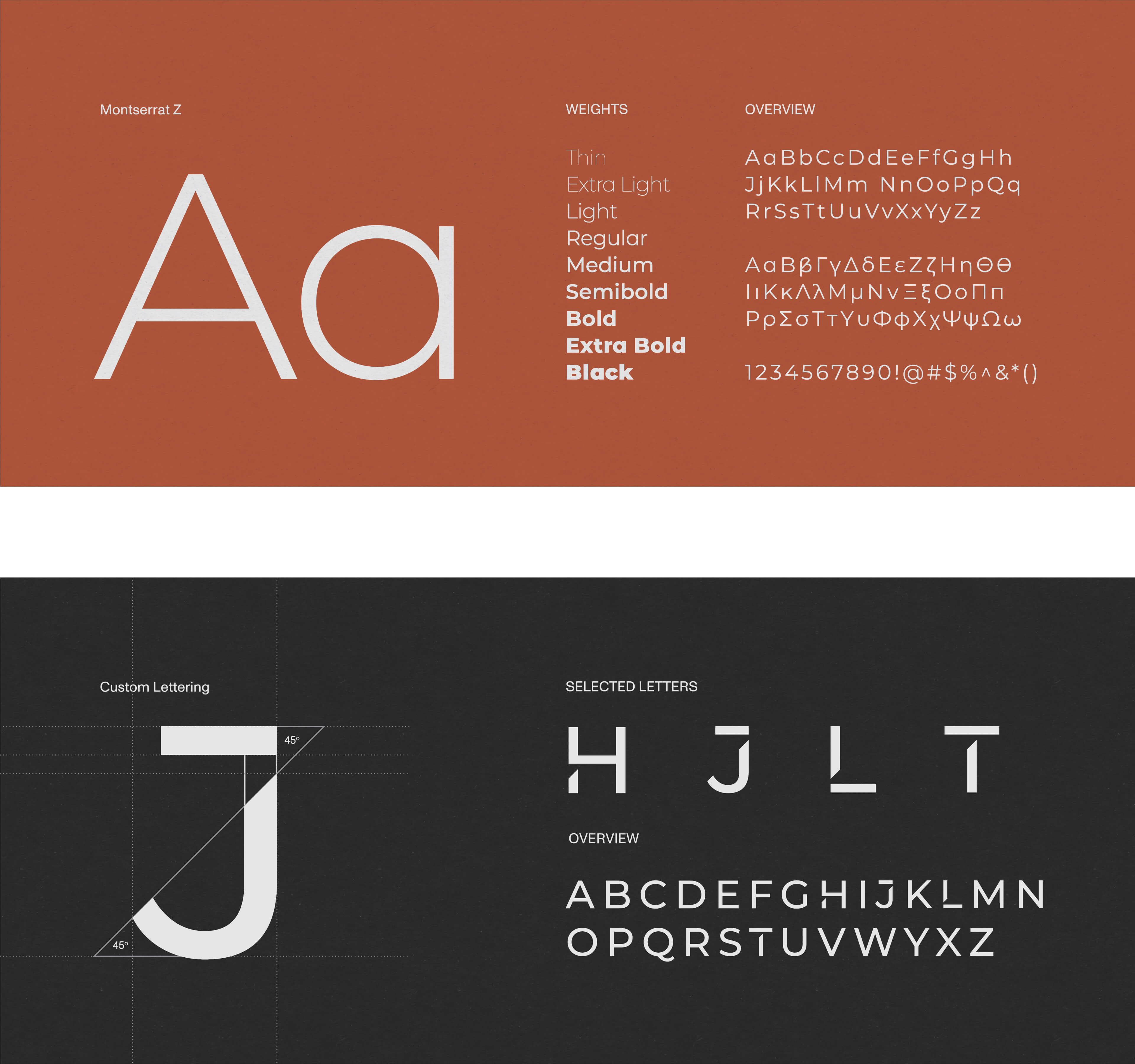
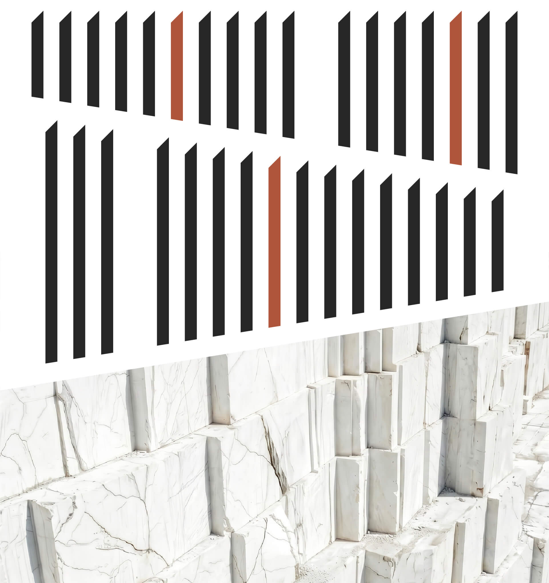
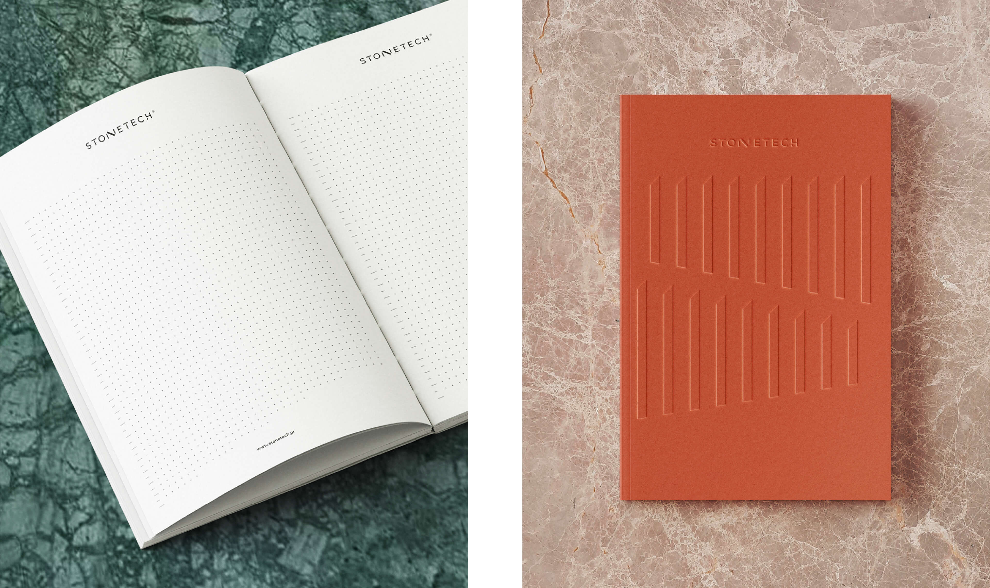
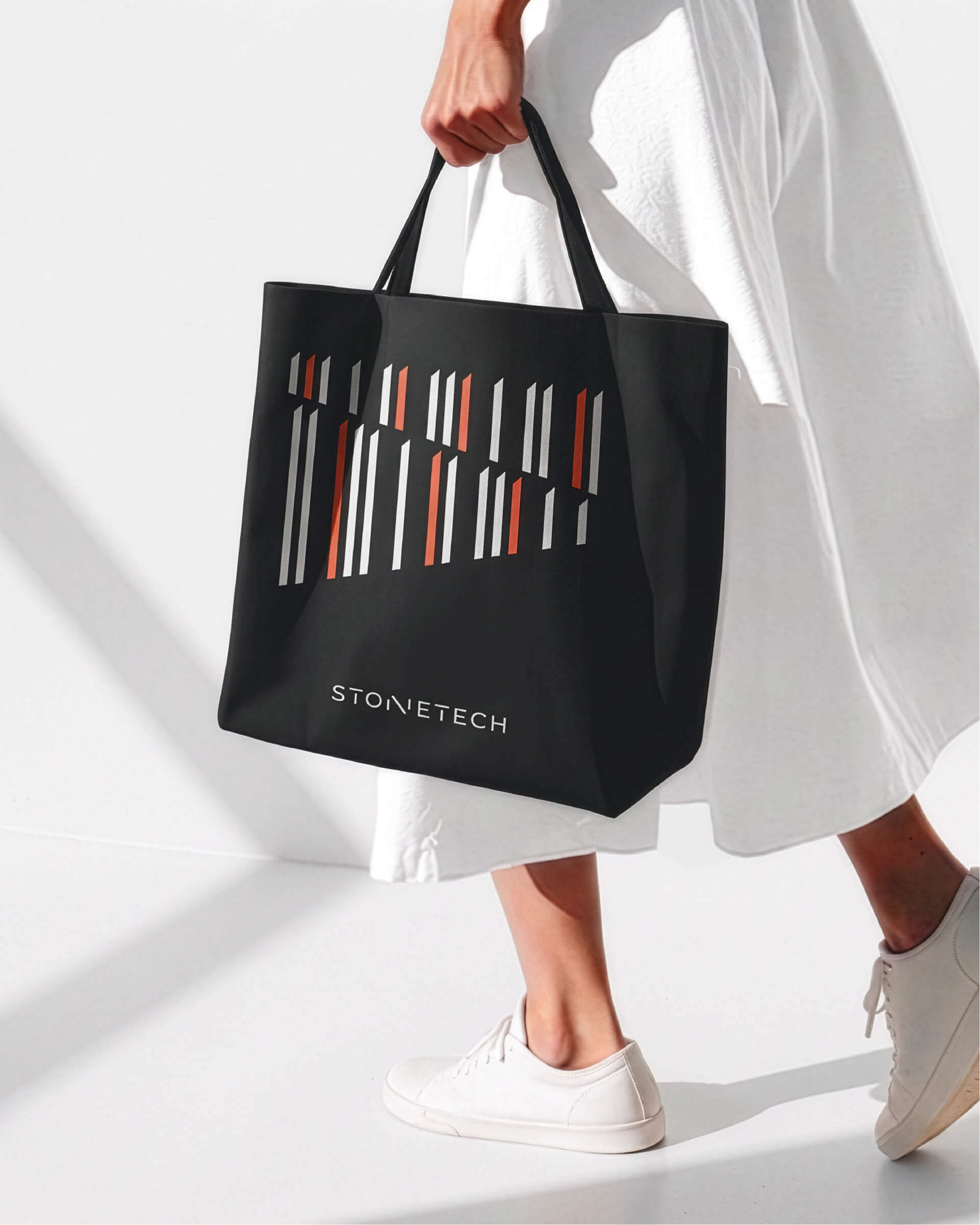
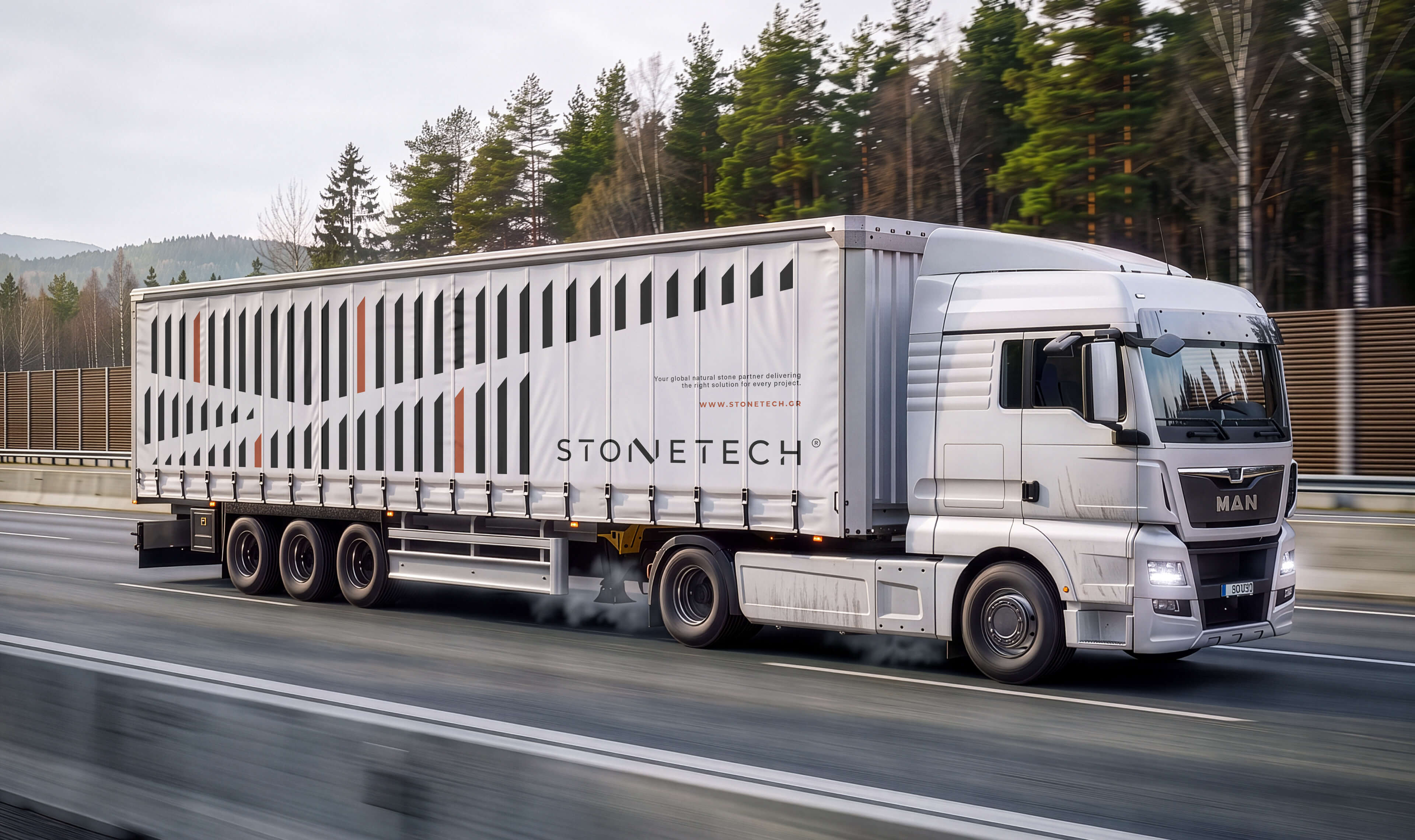
Custom lettering and a modular pattern were created from the same geometric principles as the logo, giving the wider identity a cohesive and memorable structure. The system was then applied and refined through imagery styling, editorial layouts and merchandise design, creating a flexible identity that could adapt across different formats, materials and scales while retaining its sophistication and timeless character.
TESTI MONIALS
TESTIMONIALS
Irini Giorgali
Chief Marketing Officer
Stonetech/ September 9, 2026
Working with Lazy snail on our rebranding was a genuinely creative, collaborative and thoughtful process. The team understood where our brand stands today and where it is heading, translating that evolution into a distinctive logo and a clear, confident visual identity. Their strategic thinking, creativity and attention to detail made them an excellent partner throughout the journey.
Headings, paragraphs, blockquotes, figures, images, and figure captions can all be styled after a class is added to the rich text element using the "When inside of" nested selector system.
Stonetech is a natural stone company with a 50-year heritage in marble production, direct quarry access and international supply. Its expertise spans the entire process, from sourcing and material selection to technical guidance and architectural execution. As the business prepared for its next chapter, it needed a refreshed positioning that could communicate this broader expertise and establish Stonetech not simply as a supplier, but as a trusted material expert and project partner.
Lazy snail was asked to reimagine the Stonetech brand, evolving its logo and visual identity to feel instantly recognizable, premium, functional and enduring.
The challenge was to create a more contemporary presence without losing the trust the company had built over decades.
Precision Built in Stone
Following an extensive study of the market and its direct and indirect competitors, the identity was shaped around Stonetech’s defining qualities: precision, control and technical expertise. The visual language draws from the process of cutting and refining stone, using sharp angles, balanced proportions and a considered composition to express confidence, craftsmanship and permanence.
At the centre of the logotype, the letter N is shaped as a geometric marble block held between two supporting forms. Despite its solid construction, the design remains elegant, avoiding the visual weight often associated with stone. Minimal yet distinctive, the identity balances mass with fine detailing, giving Stonetech a contemporary expression of quiet luxury.
A Material-Led Visual System
The visual identity was conceived as a complete system, extending the core concept across colour, typography, pattern, imagery and applications. A palette of black, terracotta and grey was matched with a selection of coloured technical papers, giving the printed applications a more tactile and organic feel.
Custom lettering and a modular pattern were created from the same geometric principles as the logo, giving the wider identity a cohesive and memorable structure. The system was then applied and refined through imagery styling, editorial layouts and merchandise design, creating a flexible identity that could adapt across different formats, materials and scales while retaining its sophistication and timeless character.
TESTI MONIALS
TESTIMONIALS
Irini Giorgali
Chief Marketing Officer
Stonetech/ September 9, 2026
Working with Lazy snail on our rebranding was a genuinely creative, collaborative and thoughtful process. The team understood where our brand stands today and where it is heading, translating that evolution into a distinctive logo and a clear, confident visual identity. Their strategic thinking, creativity and attention to detail made them an excellent partner throughout the journey.