Headings, paragraphs, blockquotes, figures, images, and figure captions can all be styled after a class is added to the rich text element using the "When inside of" nested selector system.

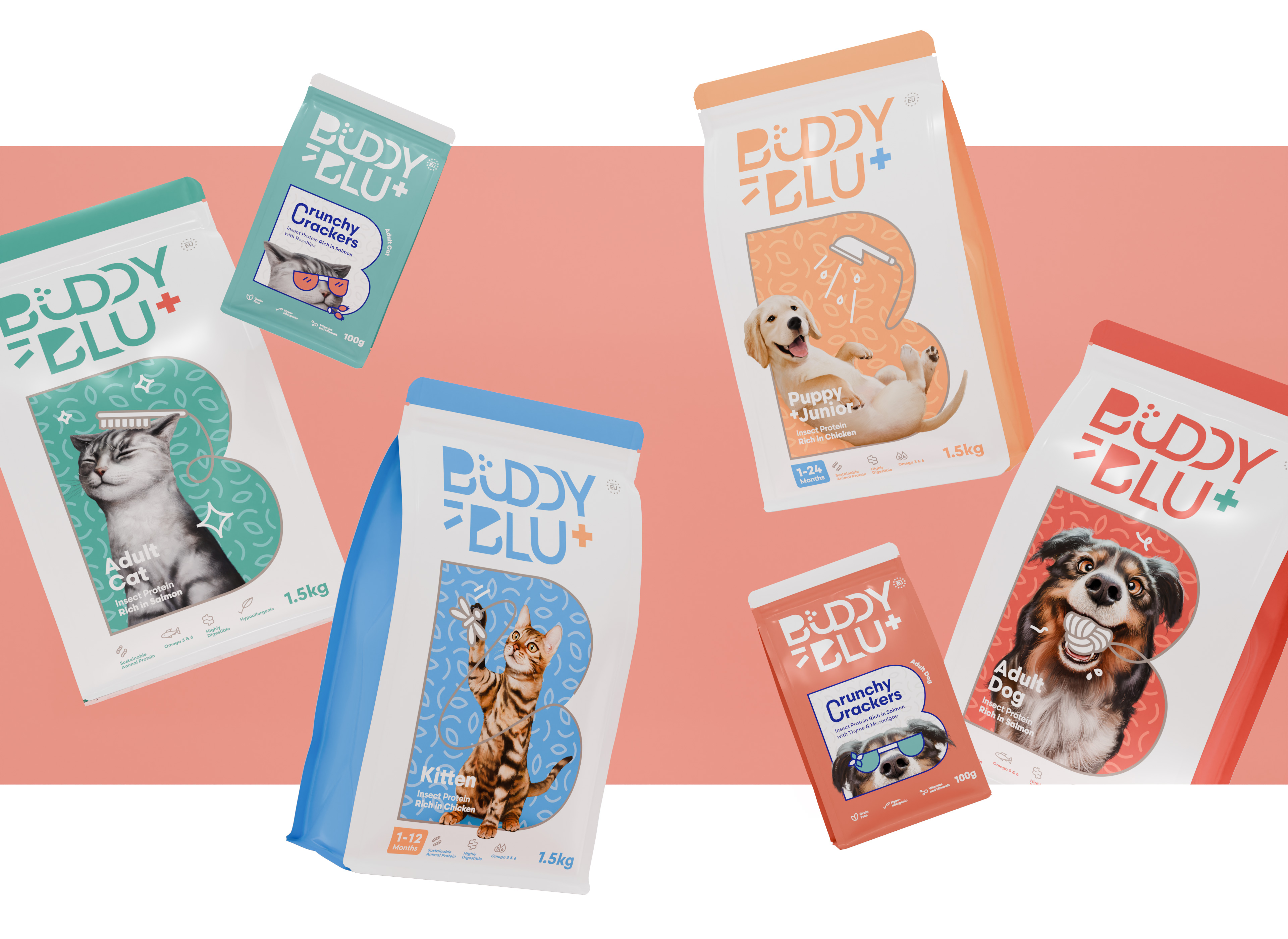
Buddy & Blu
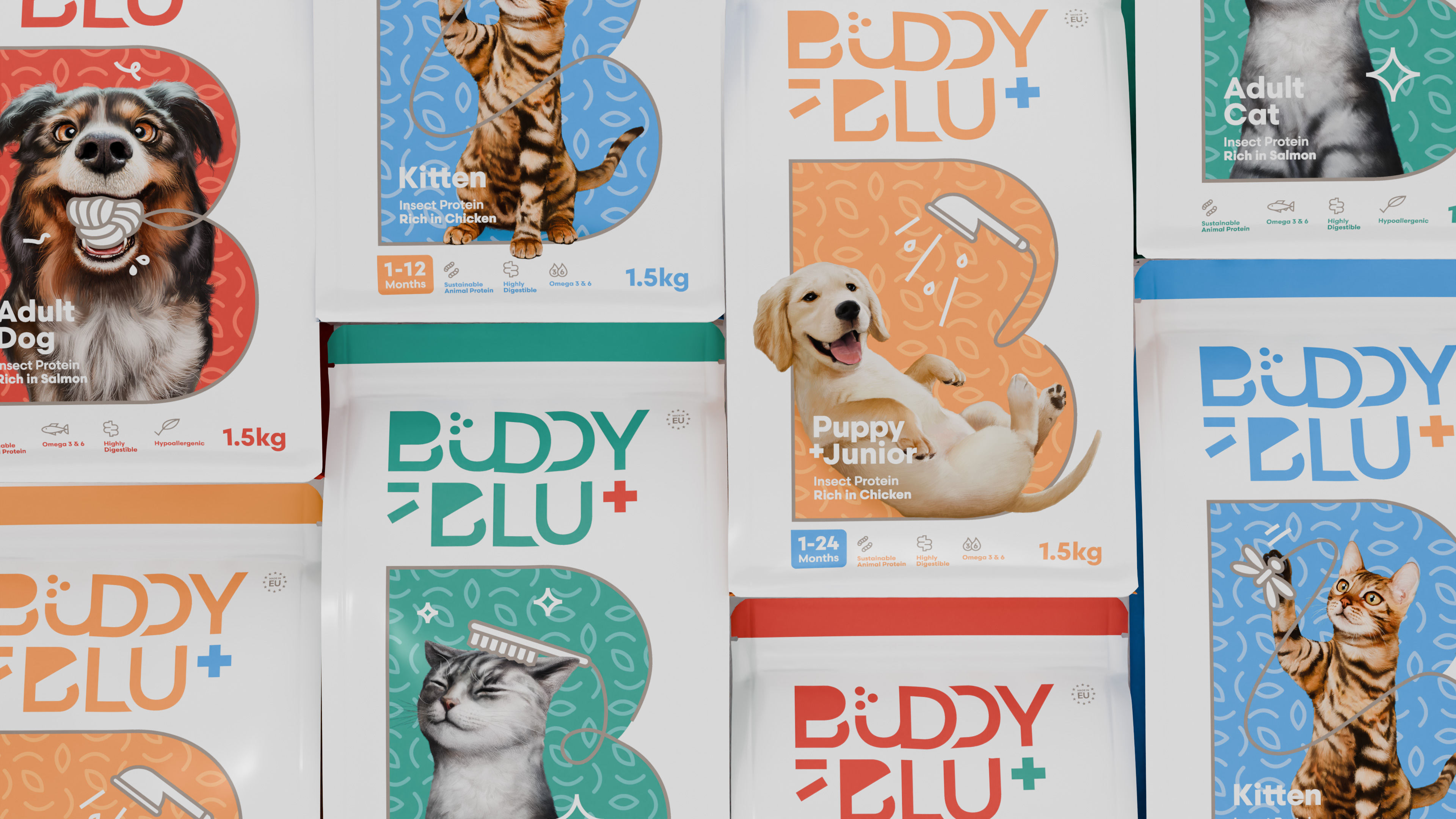
(Protei Co.) approached us with a request for a name that could express companionship, care and a new generation of sustainable pet nutrition. The brand was looking for something warm but refined, playful yet premium, a name that could travel across retail markets in Europe and resonate instantly on shelf. We developed a dual identity: Buddy speaks primarily to dogs, loyal, friendly and energetic, while Blu leans toward the feline world, elegant, intuitive and slightly more reserved. Together they form a balanced pairing that mirrors the diversity of modern pet families.
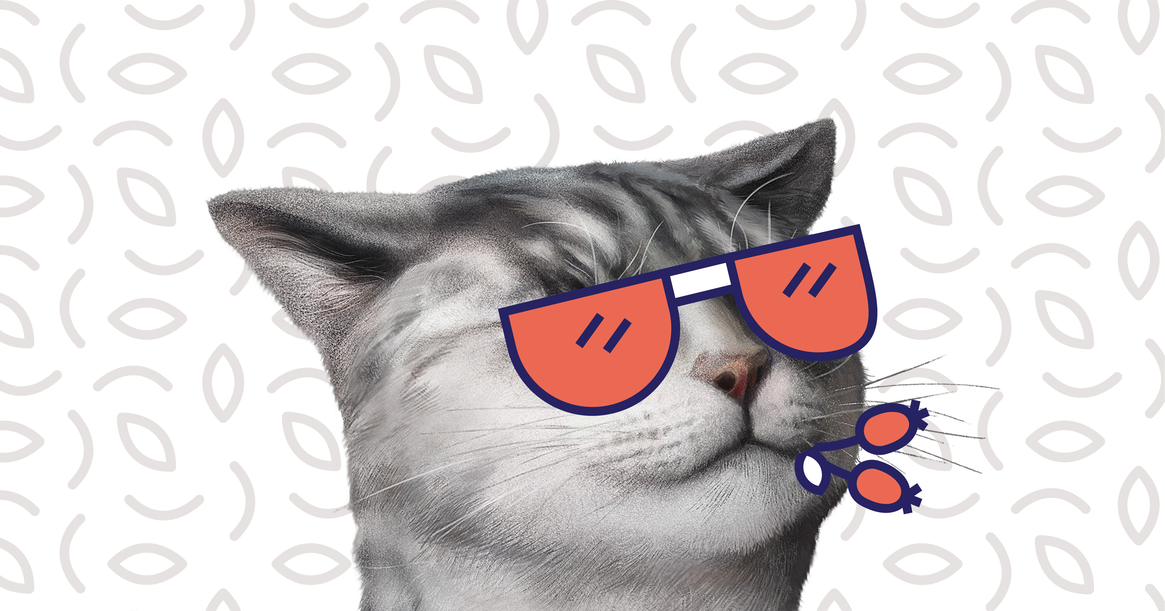
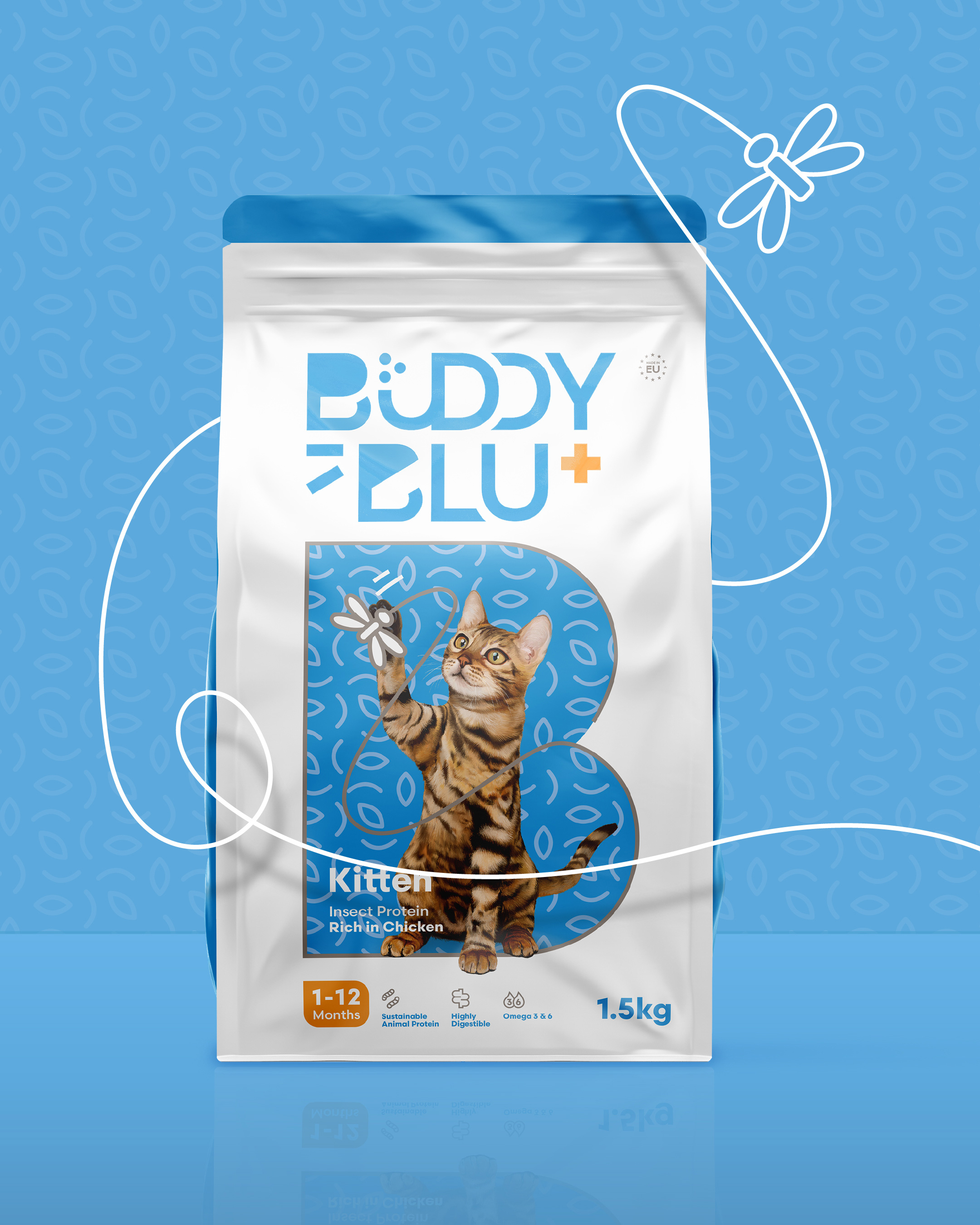
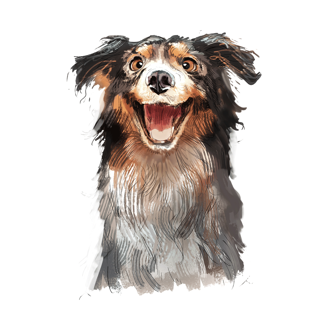
The logo was crafted to reflect this duality, combining soft curves with confident typography to balance warmth and precision in a single, memorable mark, while subtly integrating the symbolism of healthy noses as a sign of vitality and wellbeing.
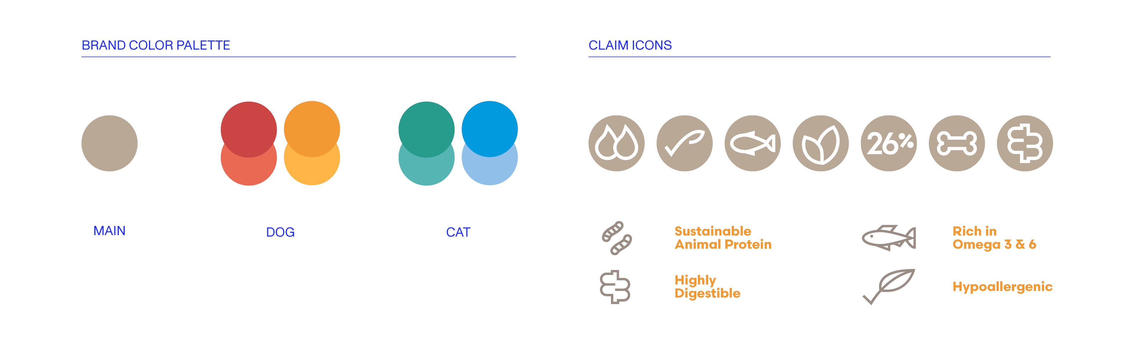
The visual language follows a clean, healthy approach combined with the minimal fresh category, softened by a subtle dash of humor. A bright neutral base builds trust and credibility, while distinct color coding differentiates dogs, cats and life stages across the range.
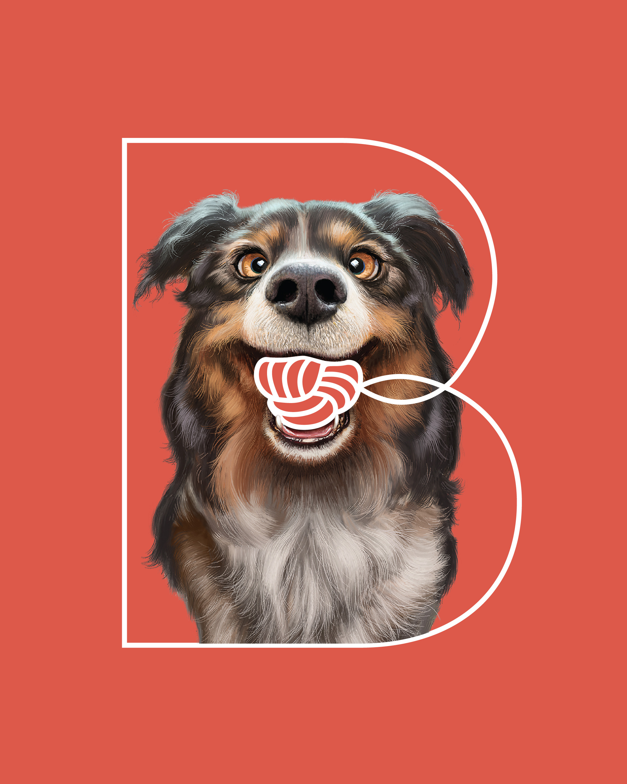
The oversized letter B becomes the core brand element, a bold structured frame that anchors the system and ensures strong shelf recognition. As the formula is based on insect protein, a key innovation of the product, the direction was to communicate this benefit in a subtle and reassuring way rather than making it loud or provocative. The emphasis remains on health, digestibility and sustainability, allowing the ingredient story to support the brand without overpowering it.
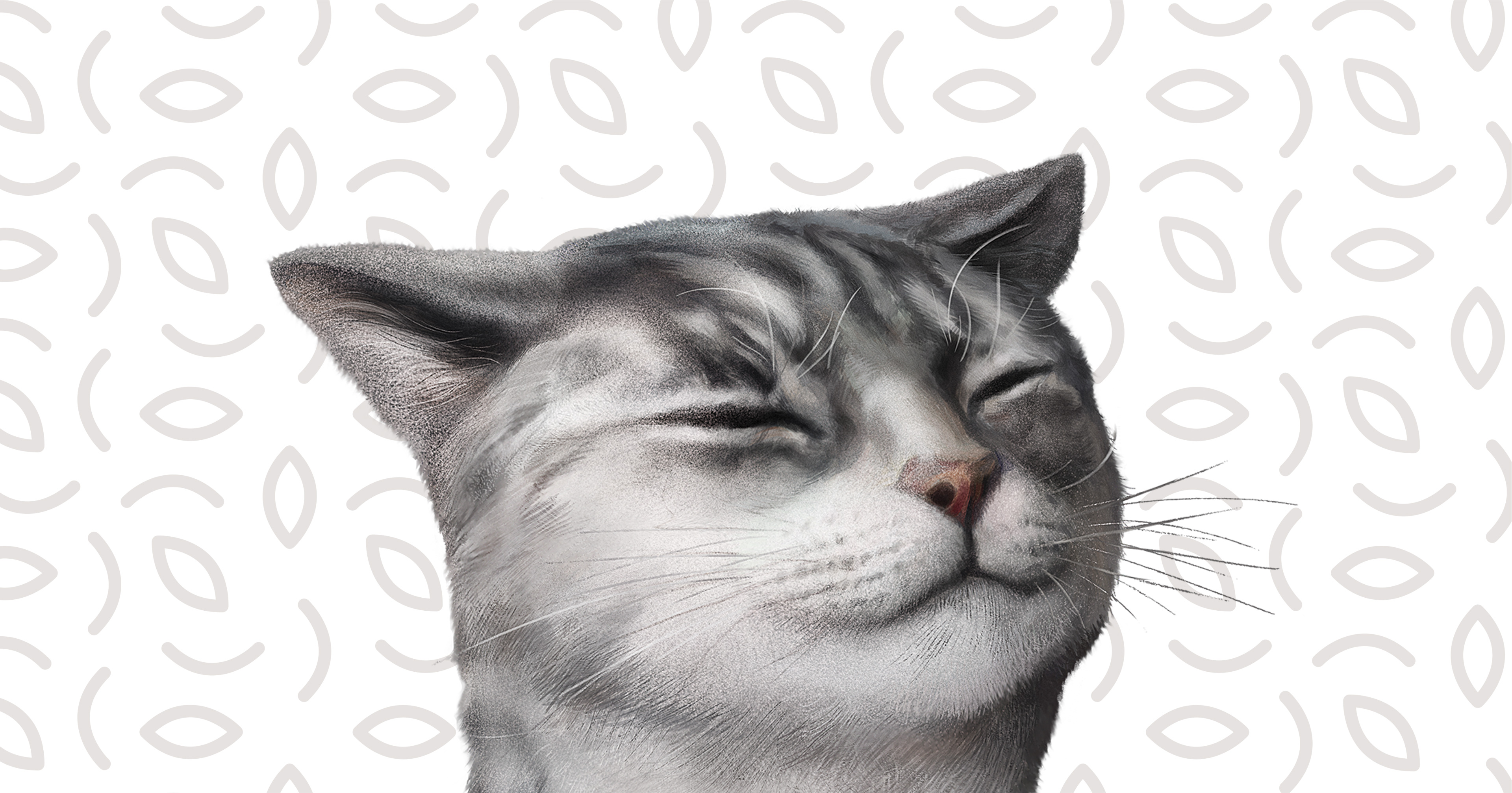
The care aspect is further expressed through visual cues such as strong teeth and soft, healthy coats, while a concise custom icon set communicates key benefits with clarity. Photorealistic portraits, add warmth and authenticity while elevating the premium feel of the brand and strengthening the emotional connection with pet owners.
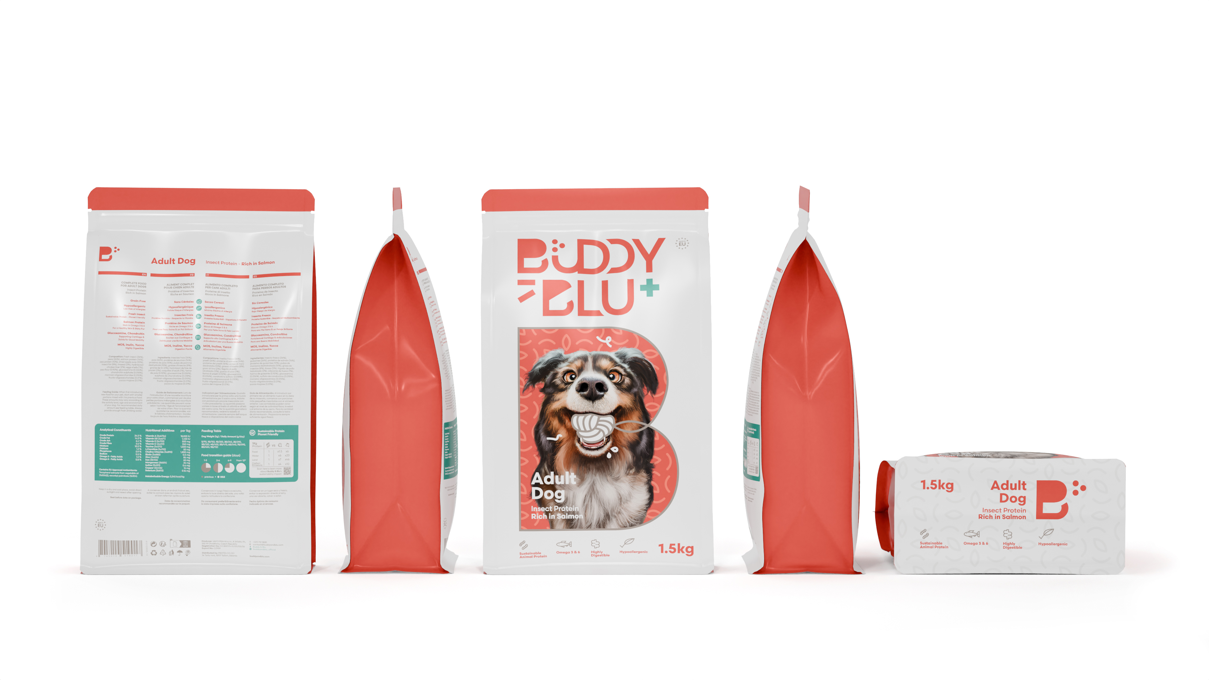
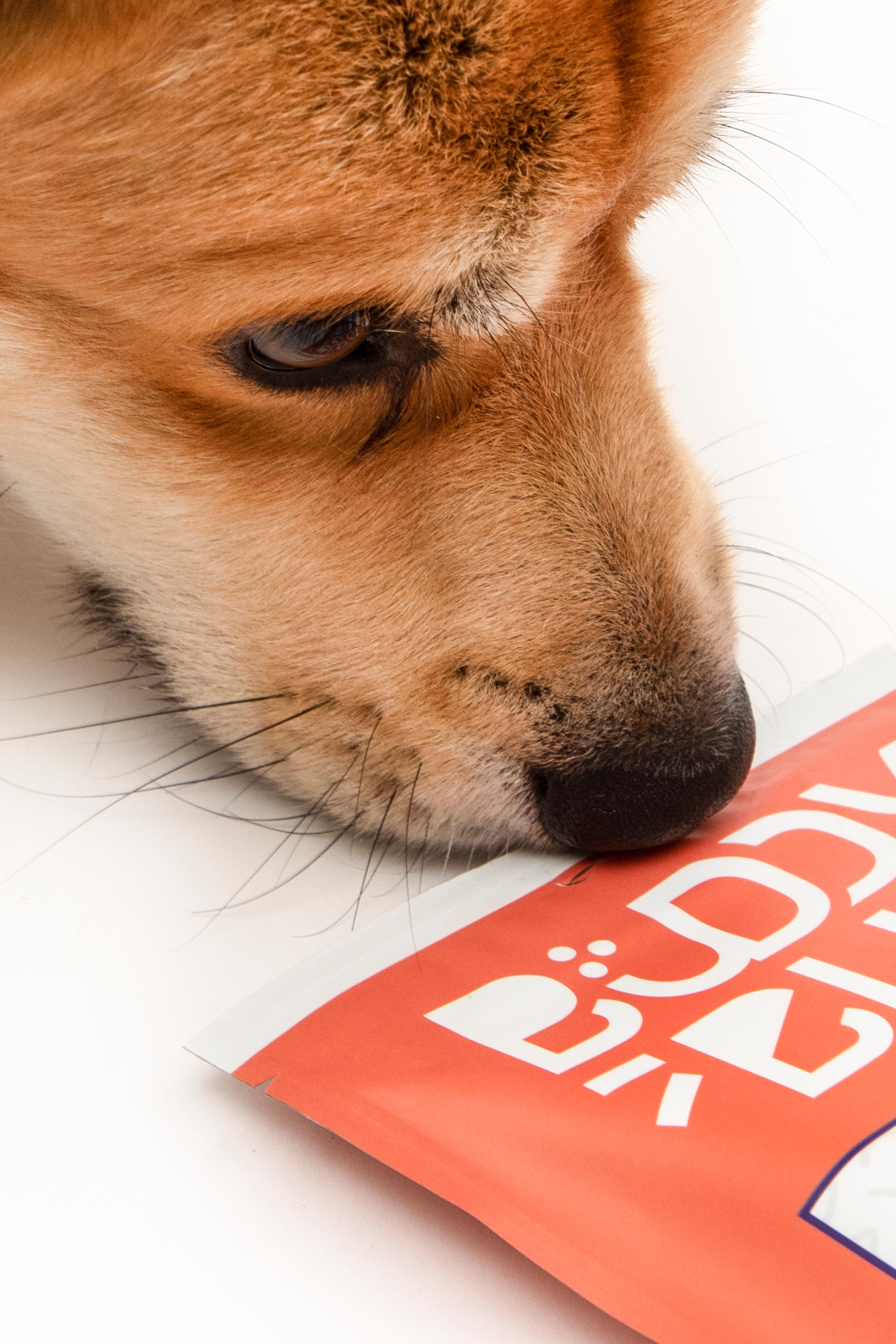
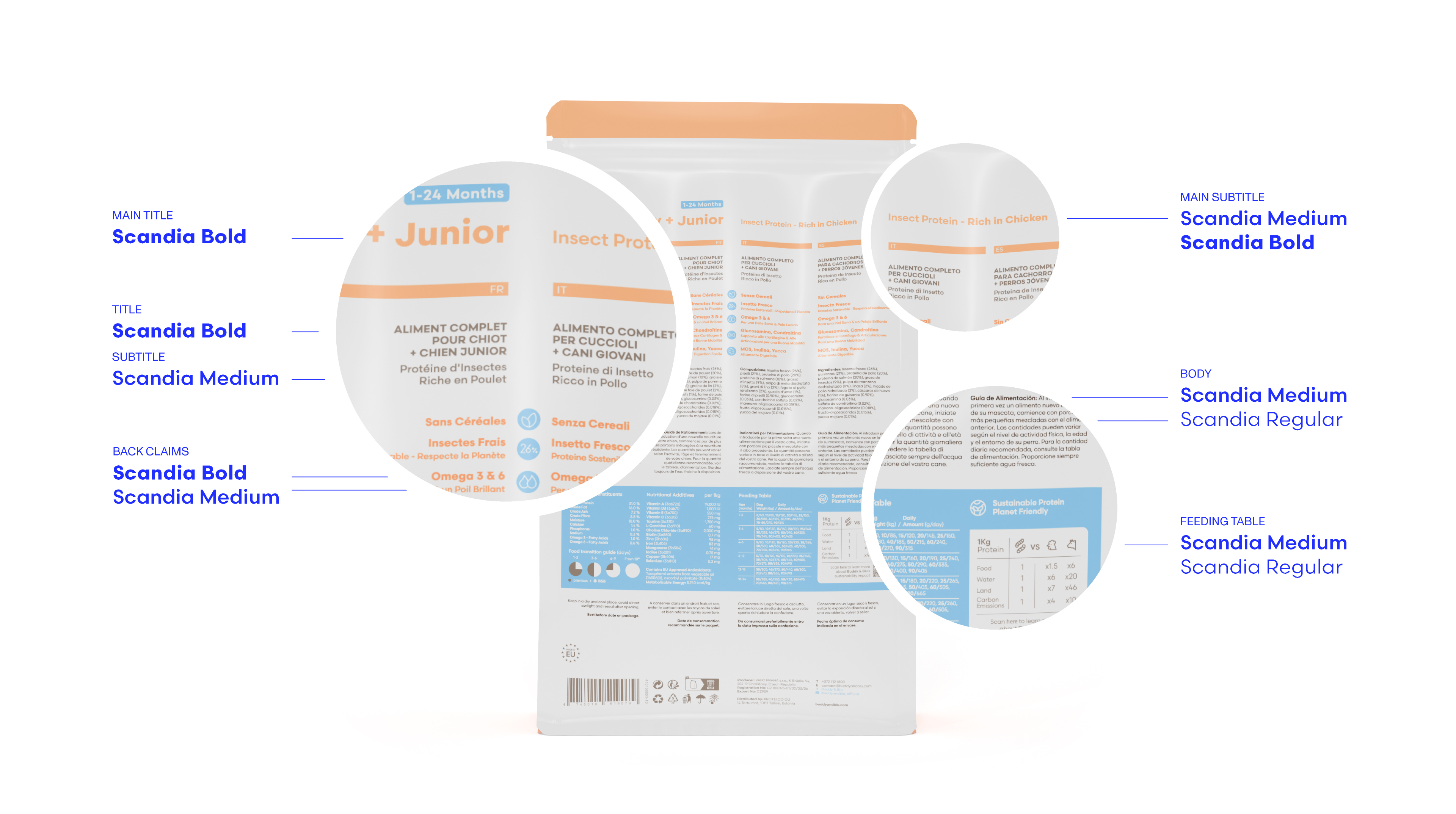
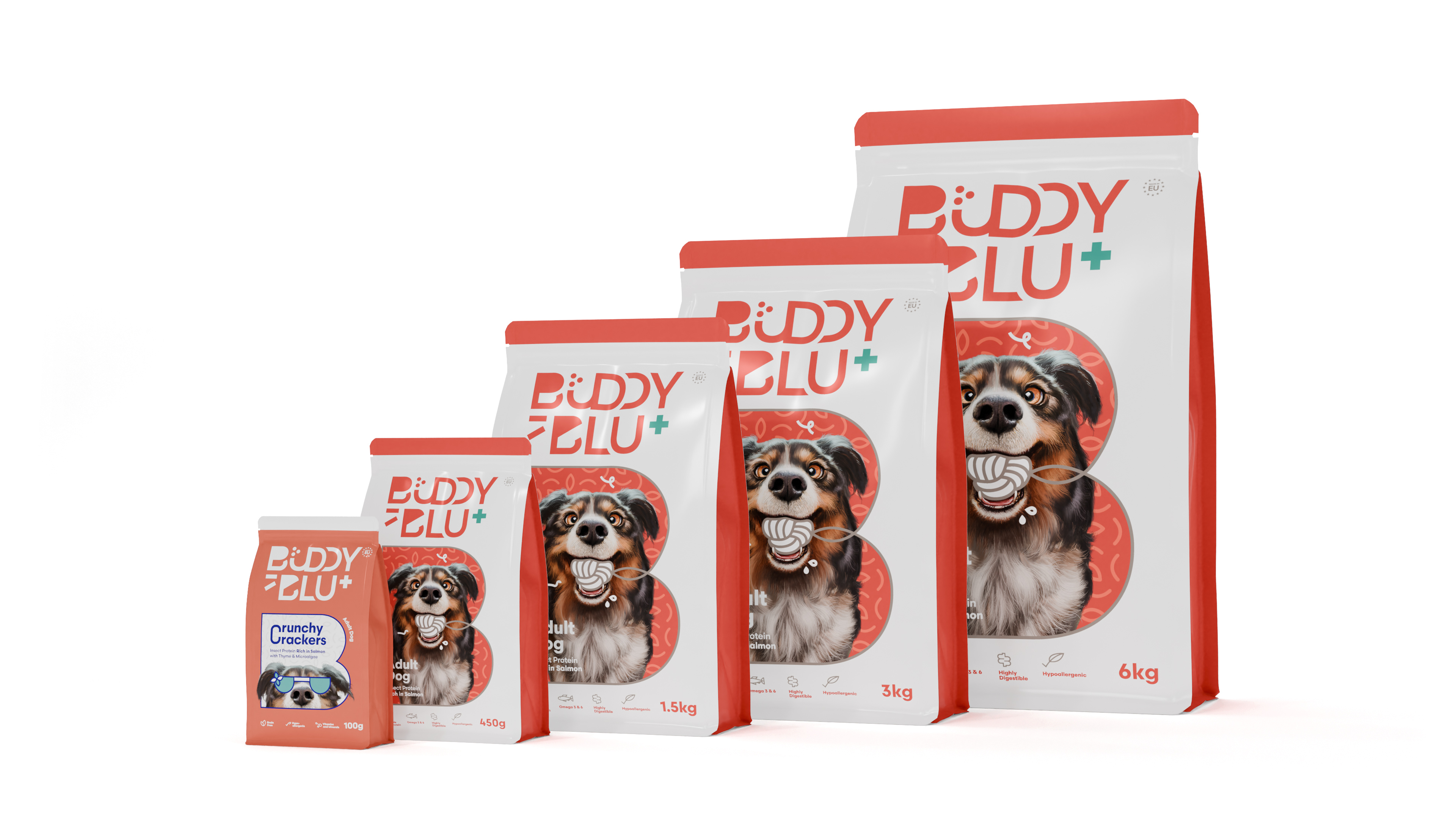
Beyond aesthetics, the project required careful portfolio structuring and clarity across multiple SKUs and life stages. The range was designed to scale consistently from 450g to 6kg formats, extending into the Crunchy Crackers treat line while maintaining a strong brand presence. A key challenge was implementing the system across four languages, ensuring hierarchy, legibility and regulatory information remained clear without compromising the minimal layout.
The result is a flexible yet disciplined packaging architecture that supports growth, variation and strong shelf impact within a competitive retail environment.
COLLABS:
Naming: Rasmus Holmgård
COLLABS:
Naming: Rasmus Holmgård
COLLABS:
Naming: Rasmus Holmgård