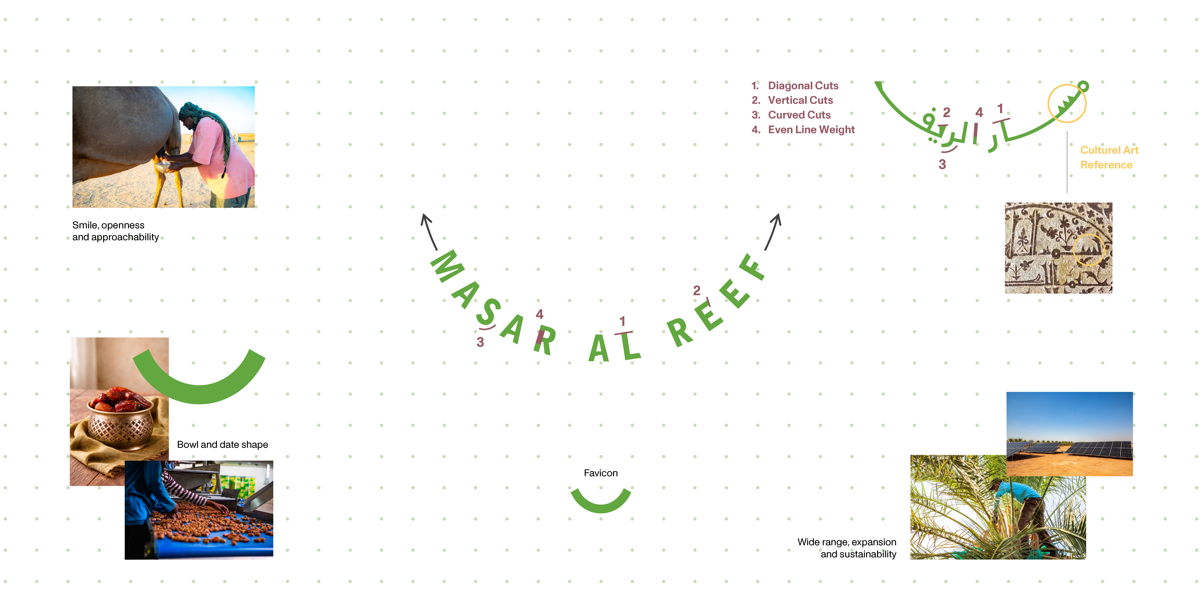
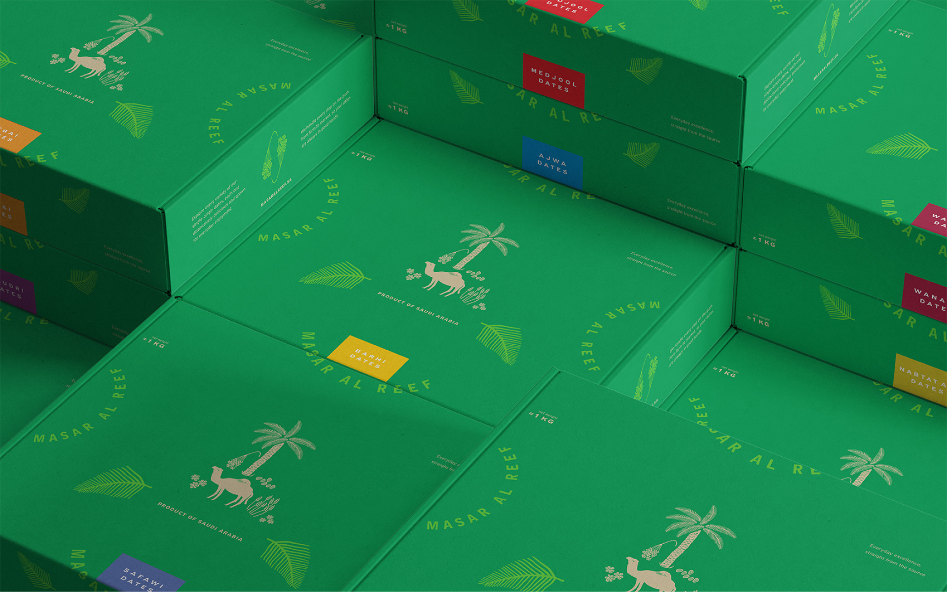
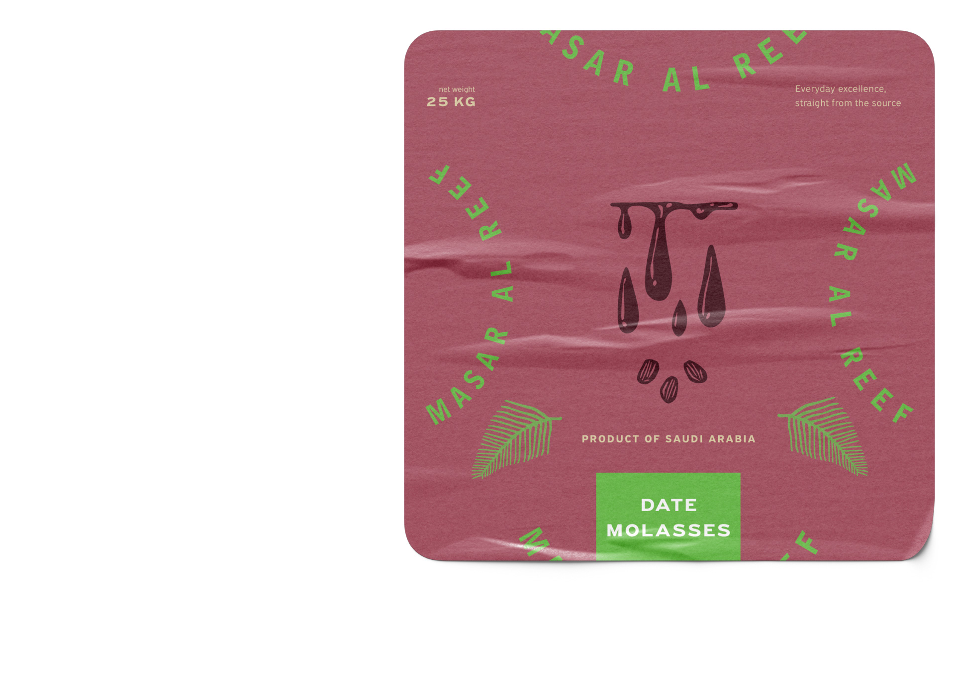
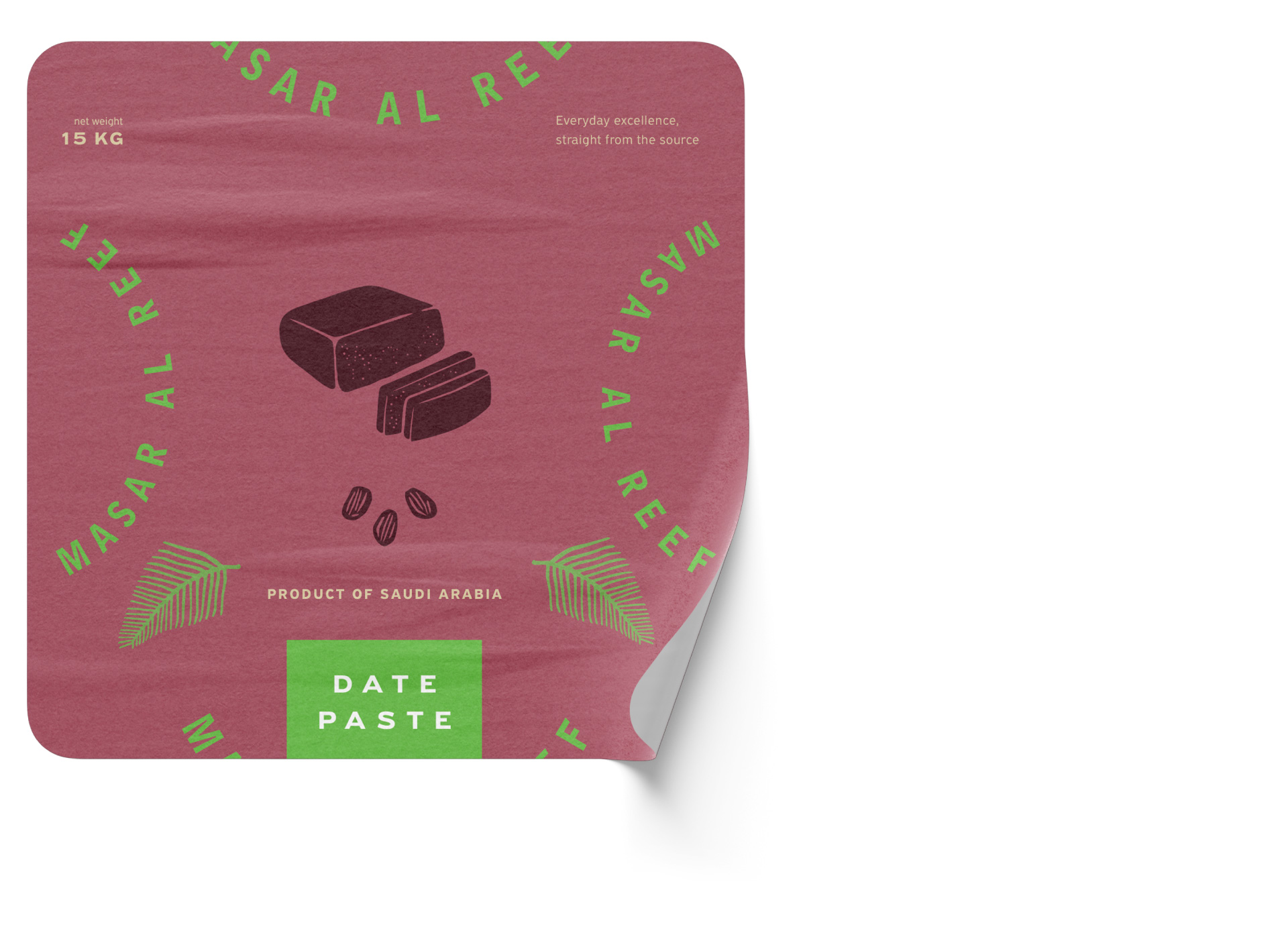
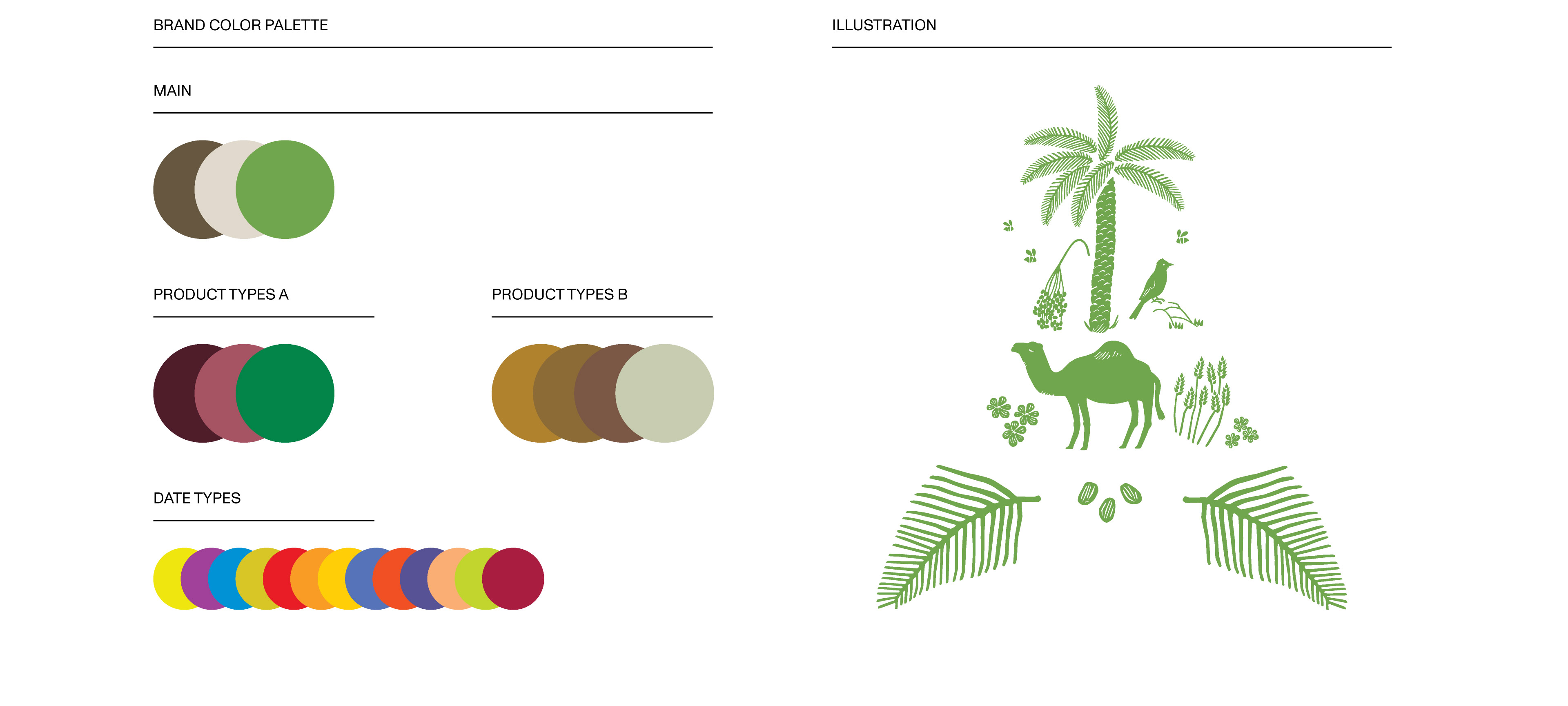
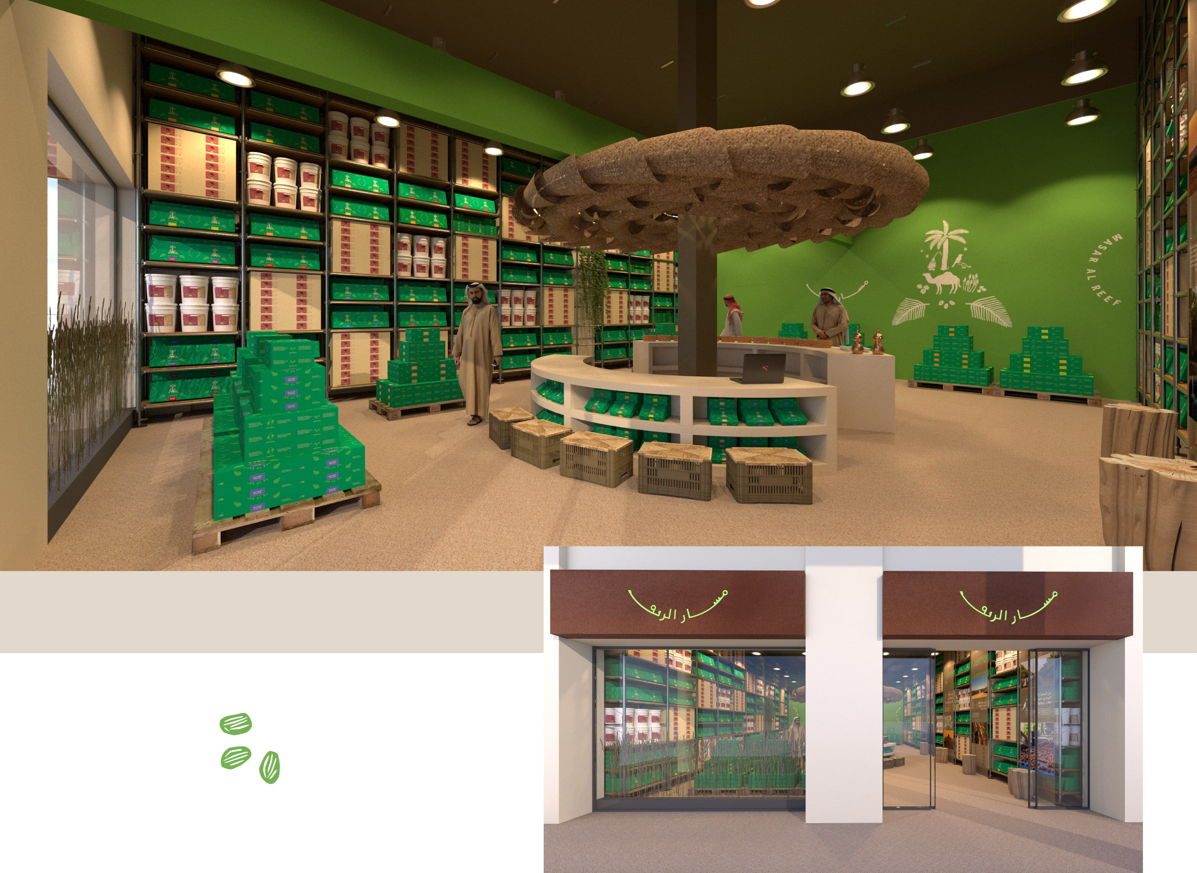
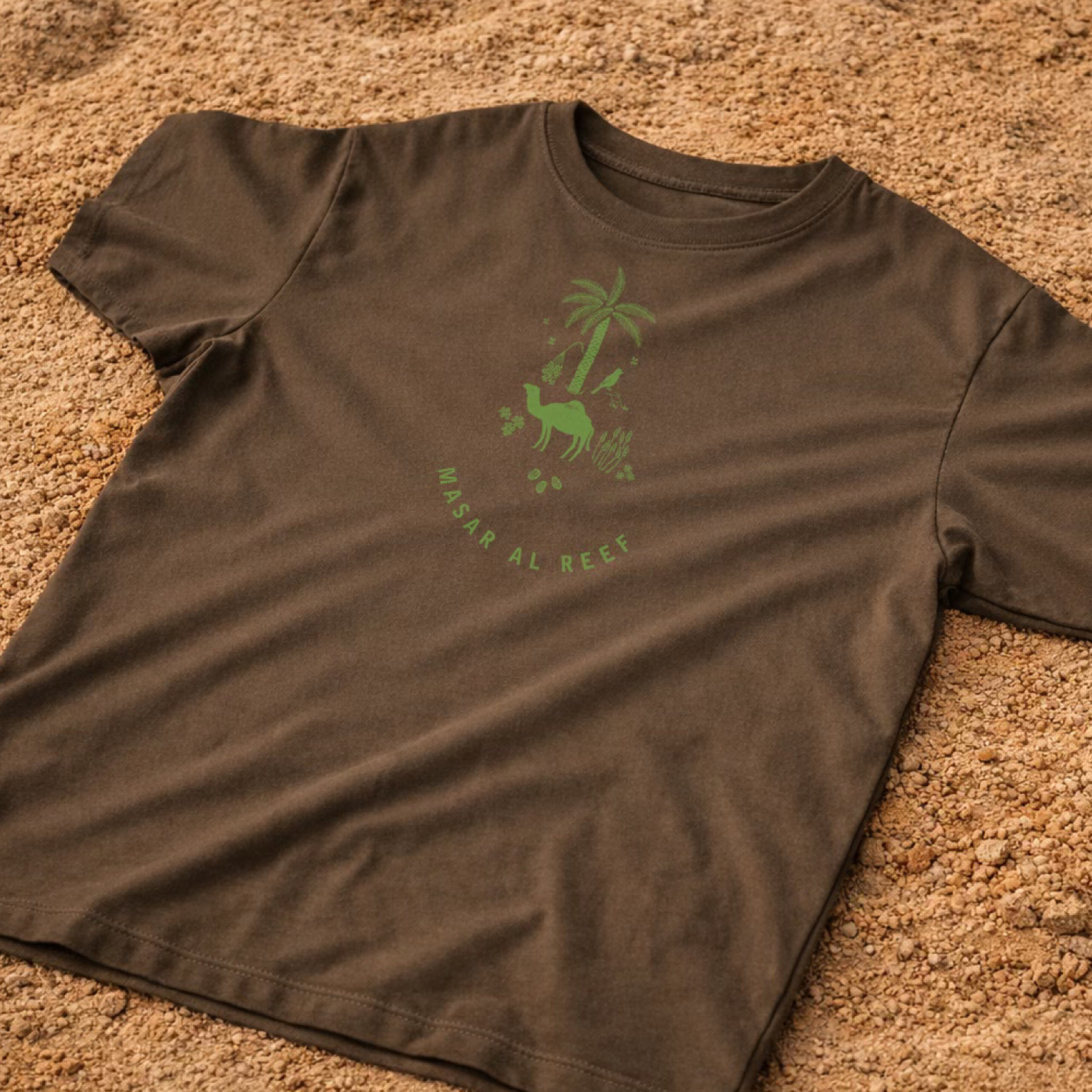
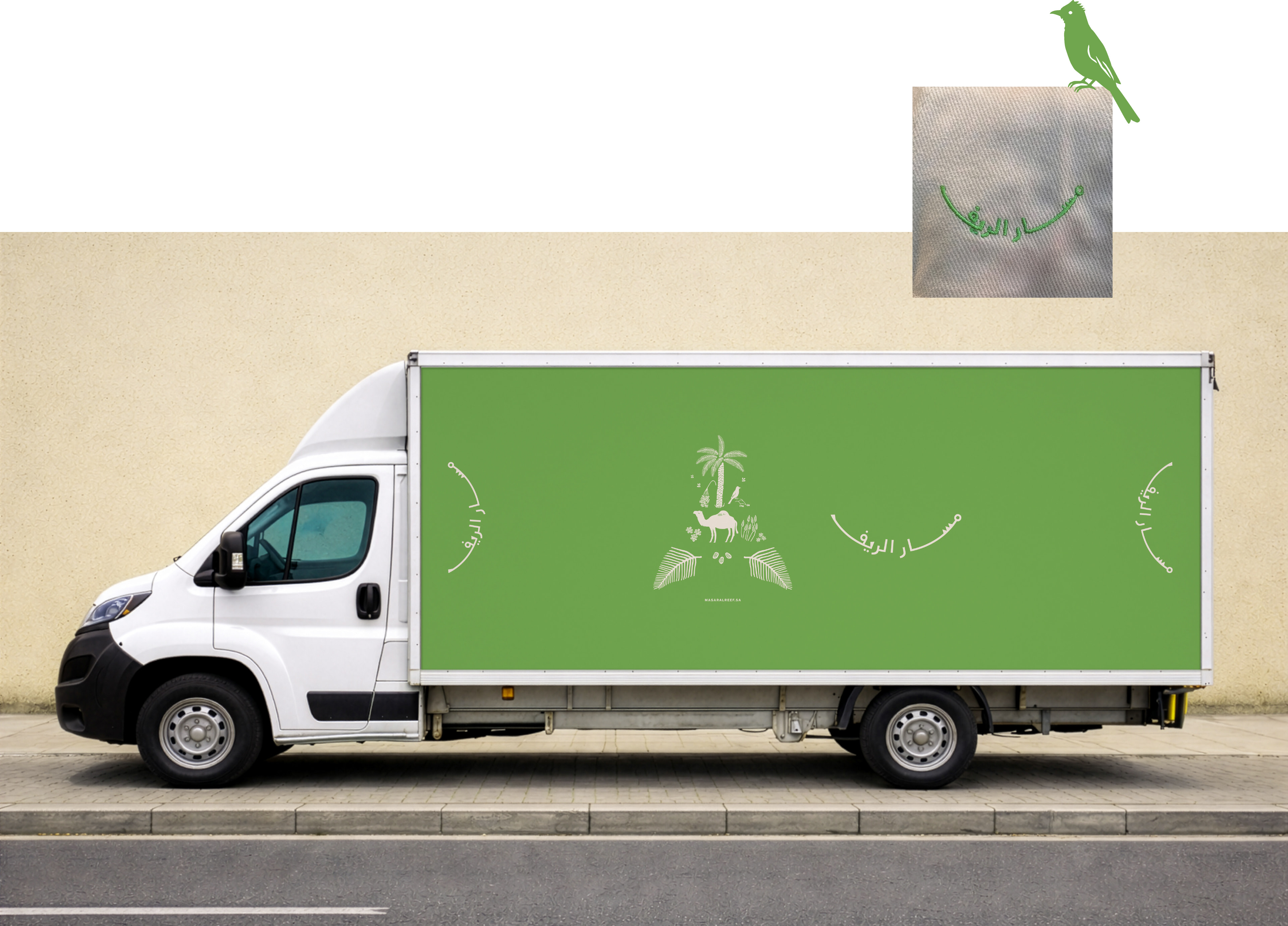
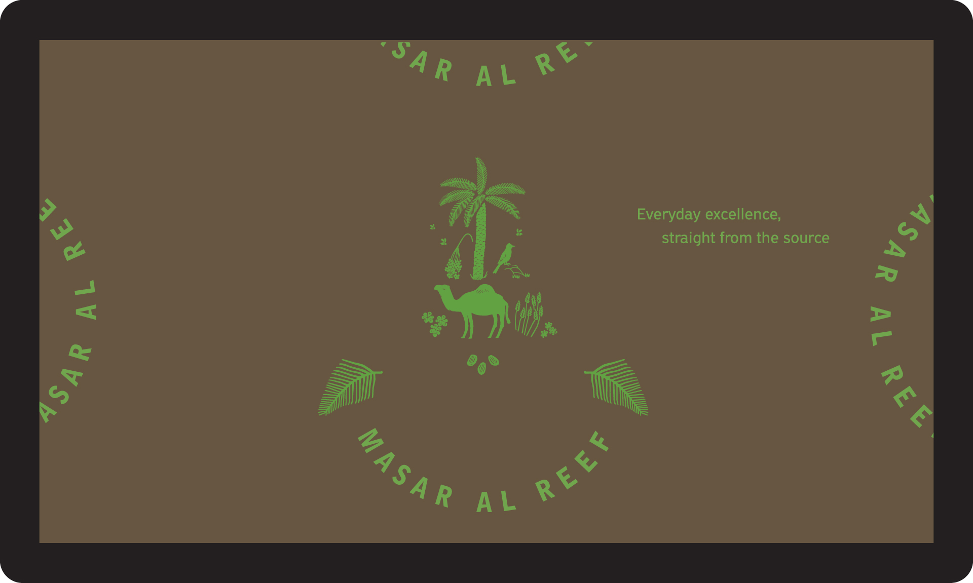
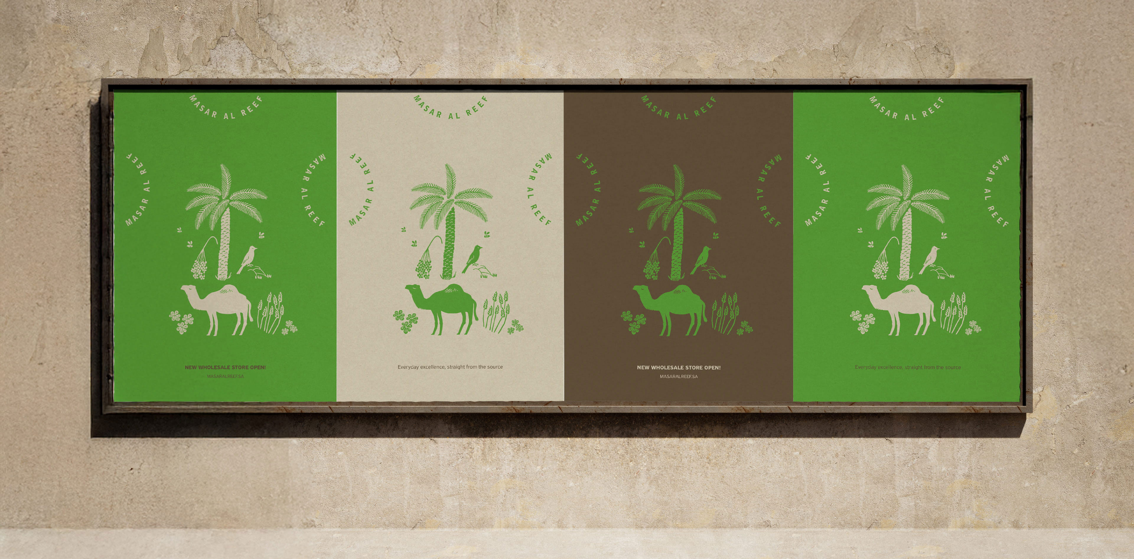
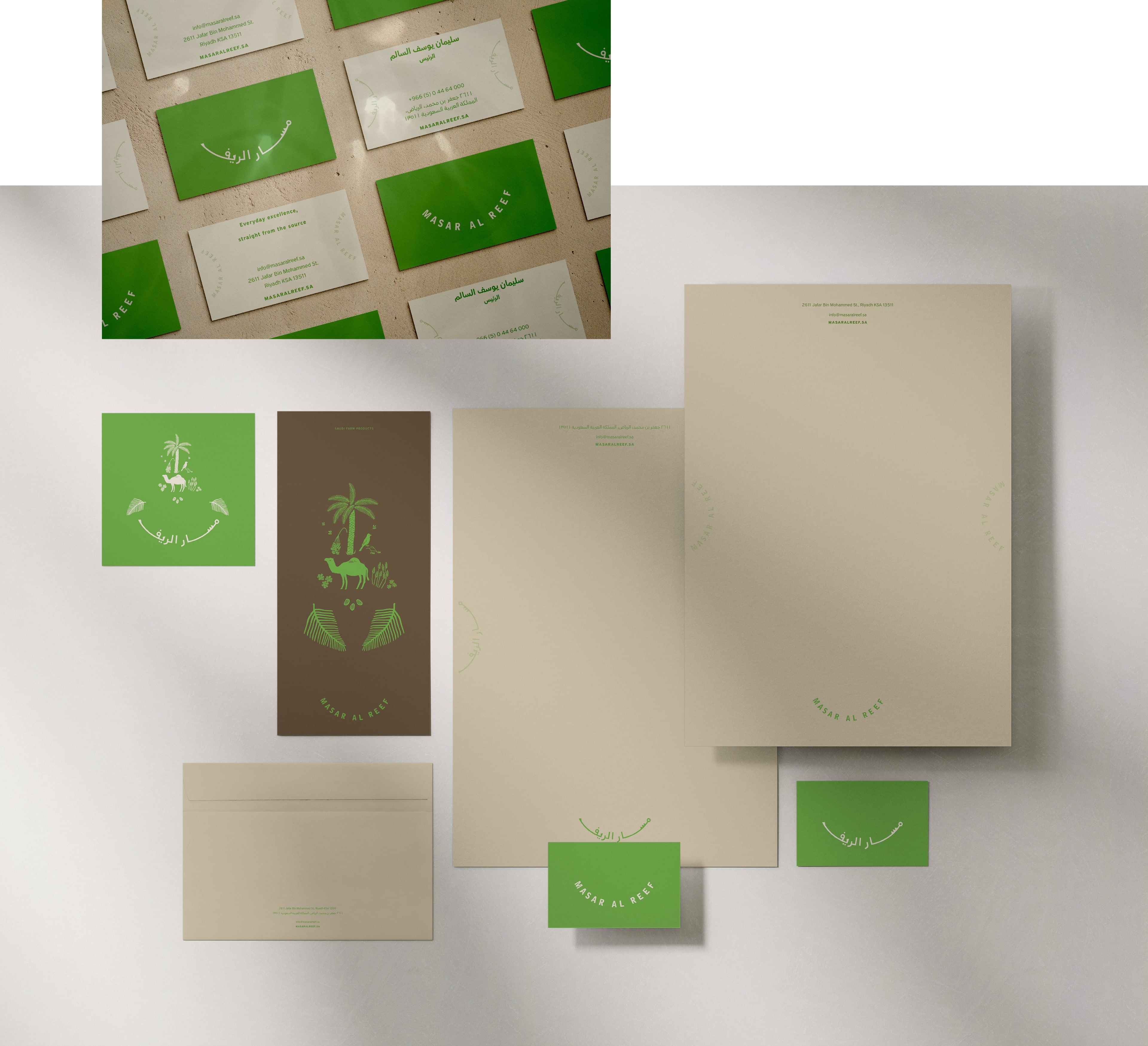
The visual identity tells the brand’s story with warmth, balance, and authenticity. Hand-drawn illustrations such as palm trees, dates, camels, and foliage are composed in calm, harmonious rhythms that reflect the interconnected life of the farm.
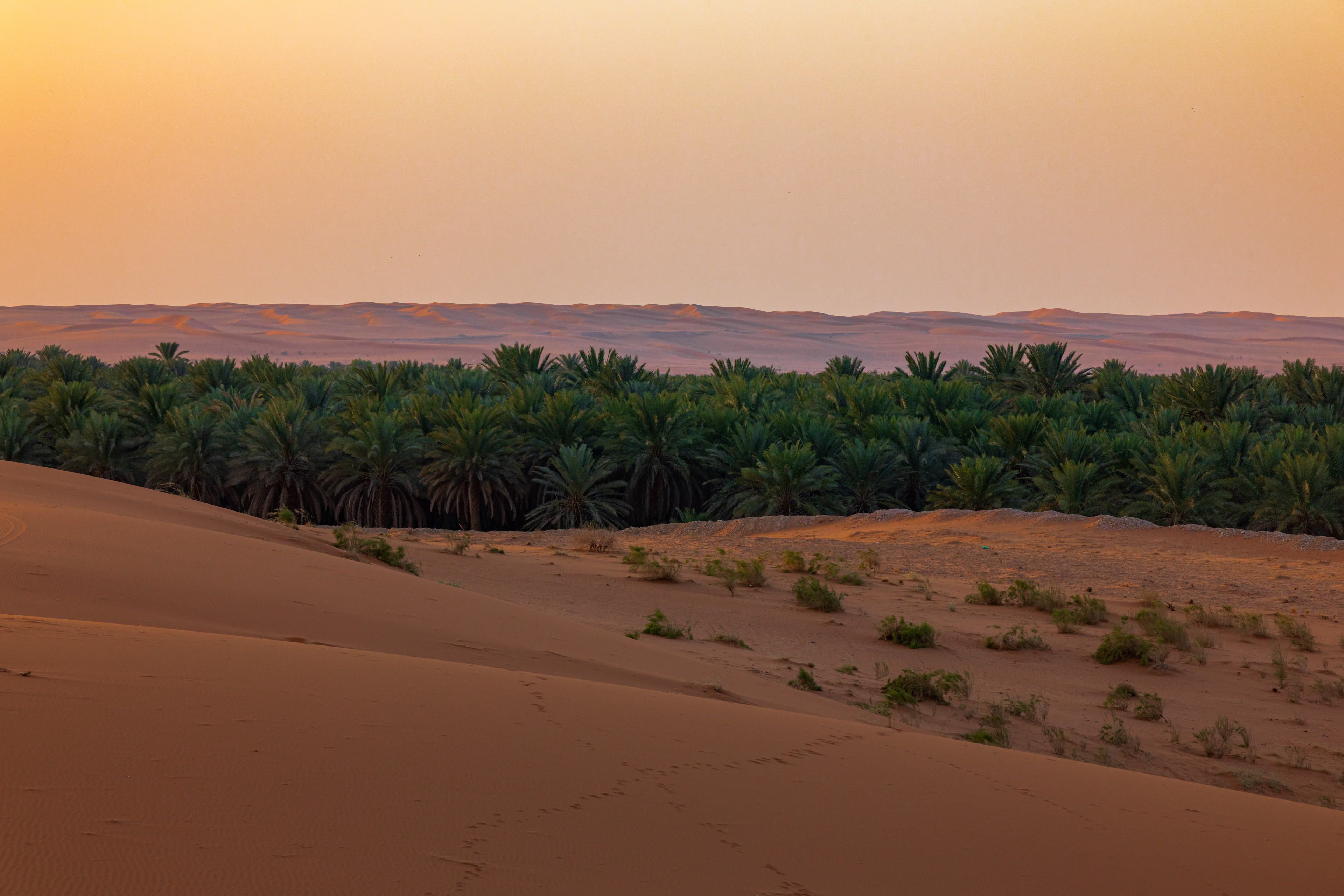
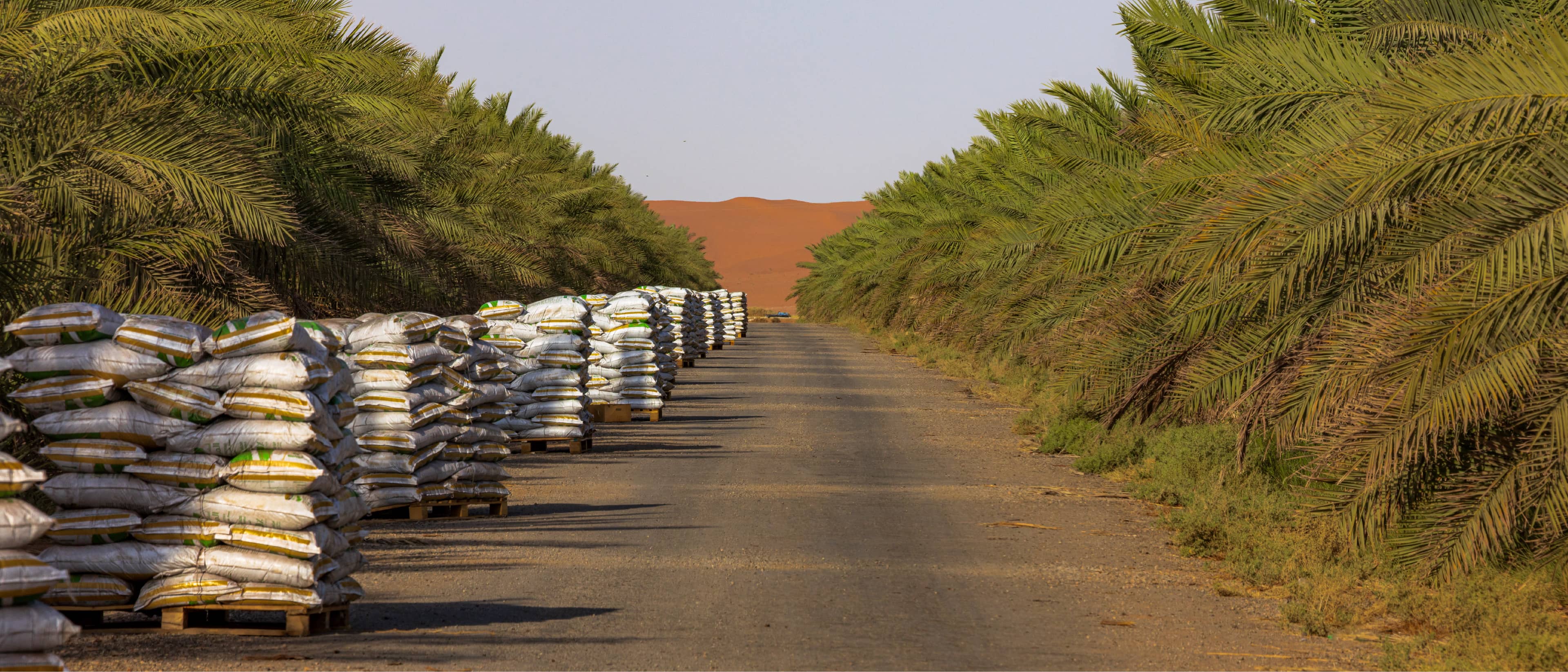
Photography focuses on real moments across agriculture and production, showing real hands, real processes, and real landscapes in warm, natural tones.
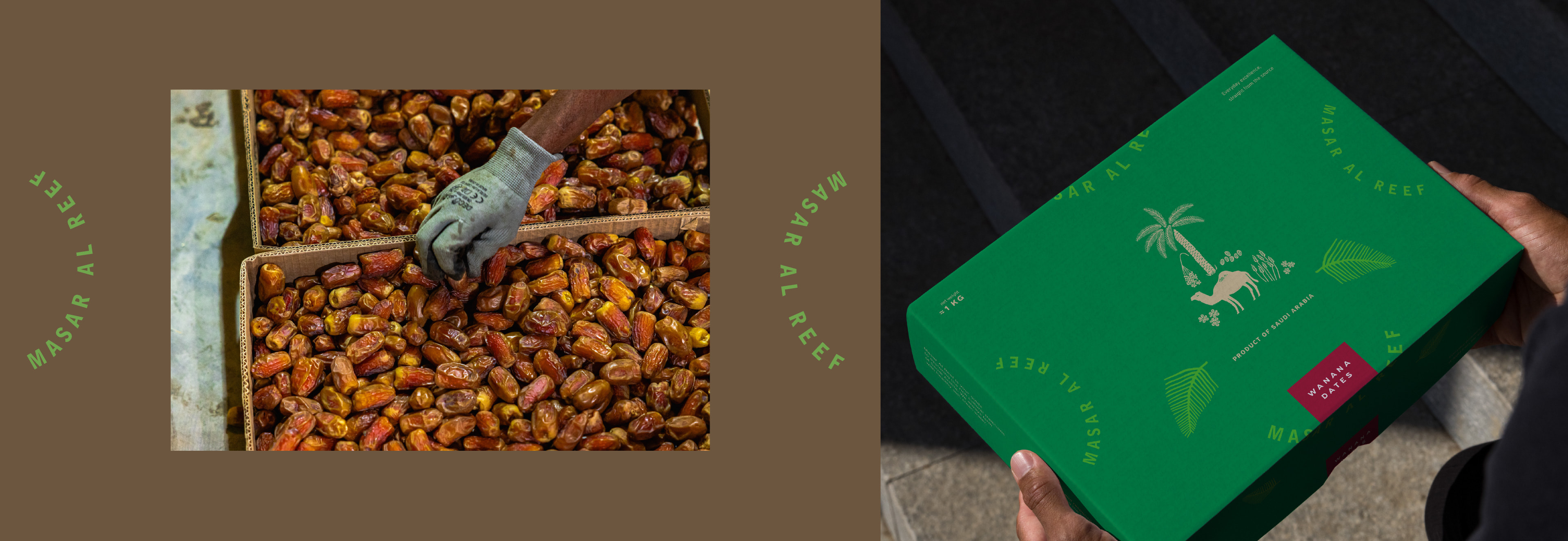
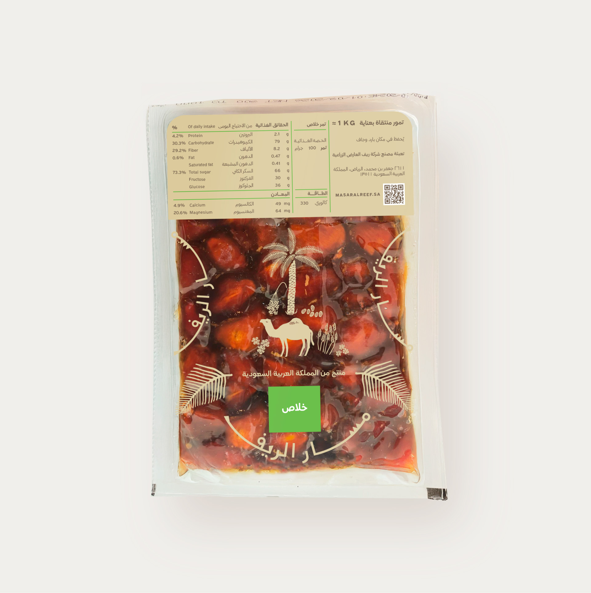
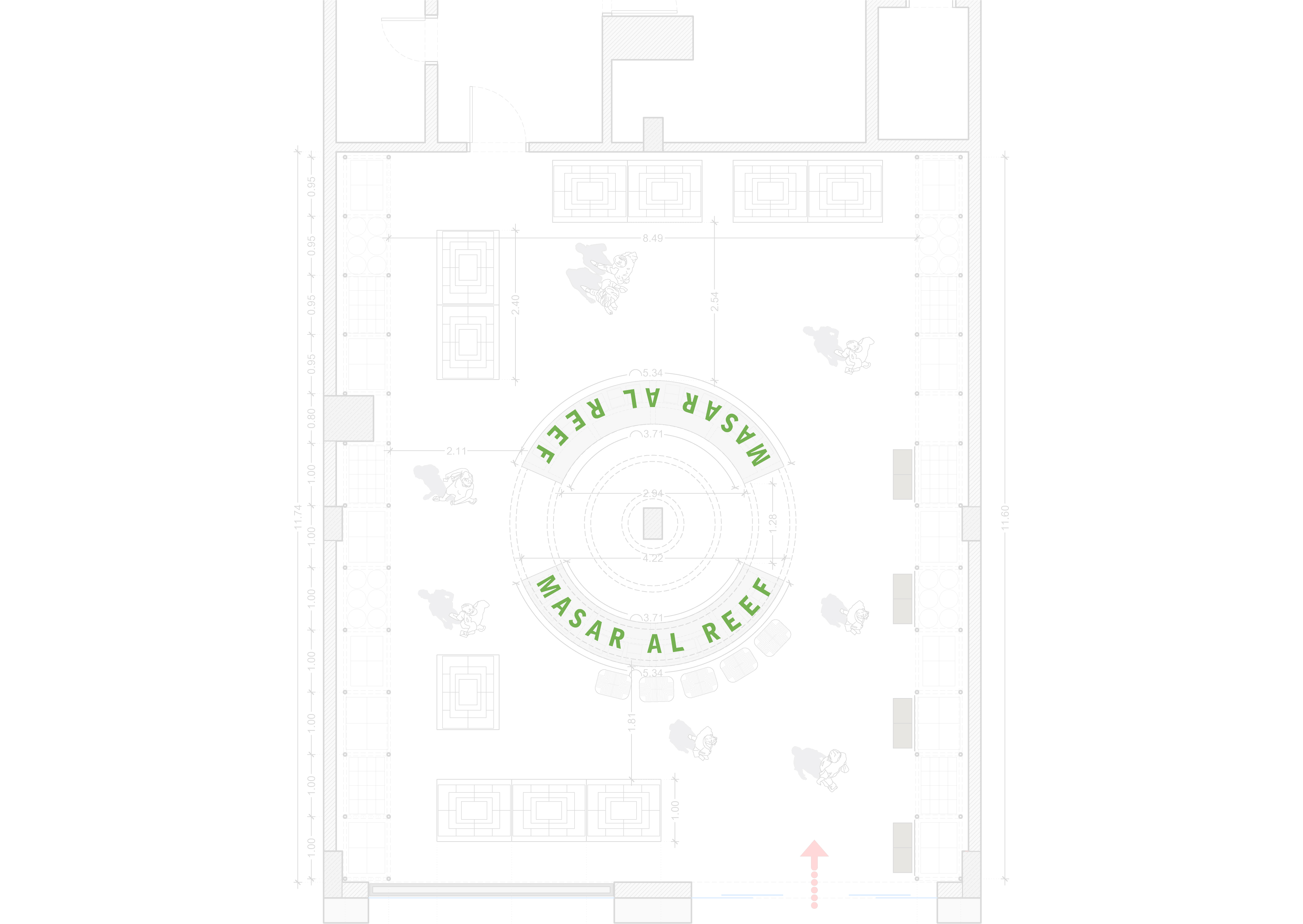
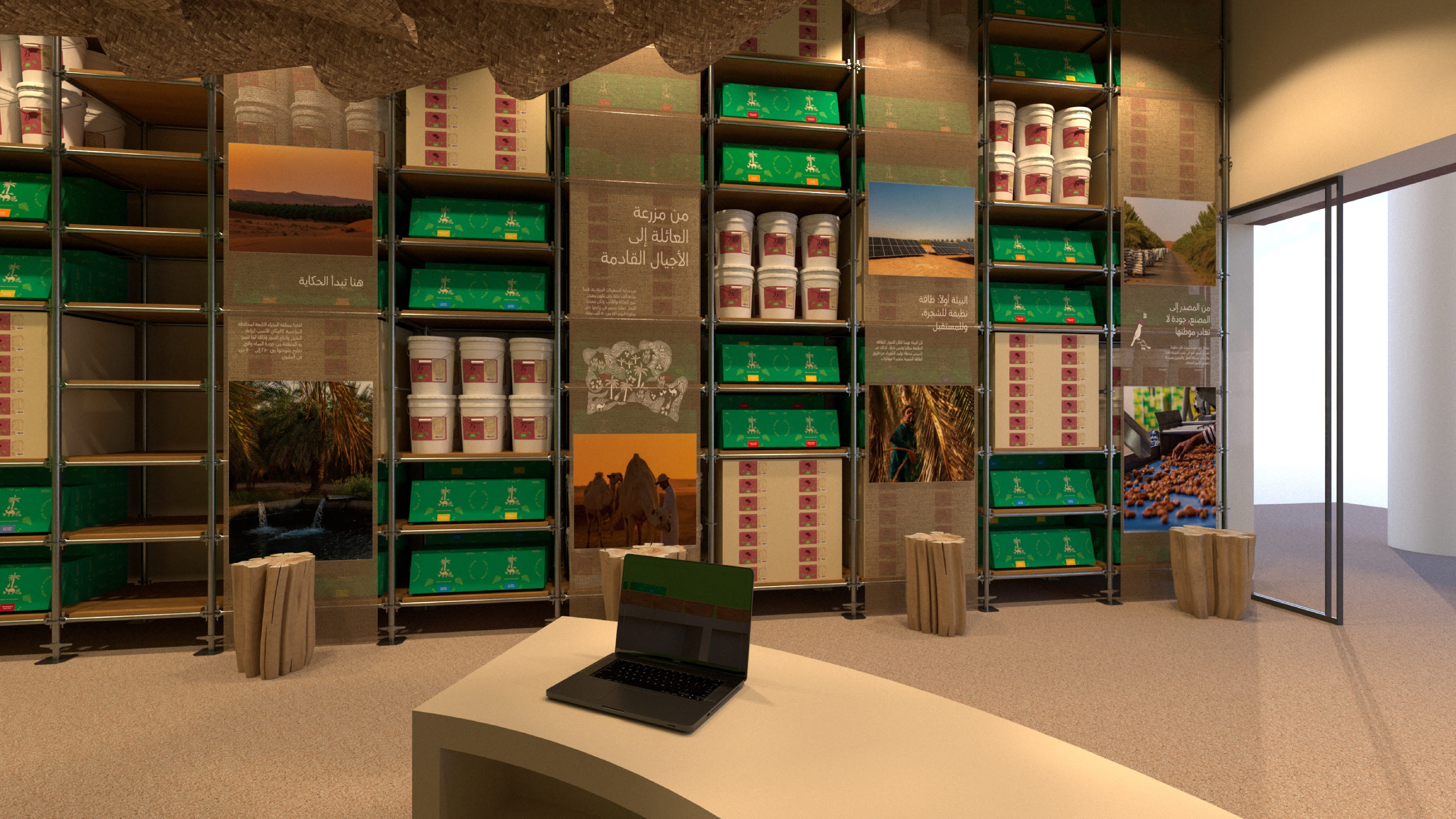
The identity extends consistently across packaging, print, digital applications, uniforms, and vehicles. Practical and considered, it remains approachable, trustworthy, and proudly rooted in Saudi soil.